My blog started in 2009, so there are major projects we completed before then which have not been featured as ‘Case Studies’ that we are very proud of, this is one of them.
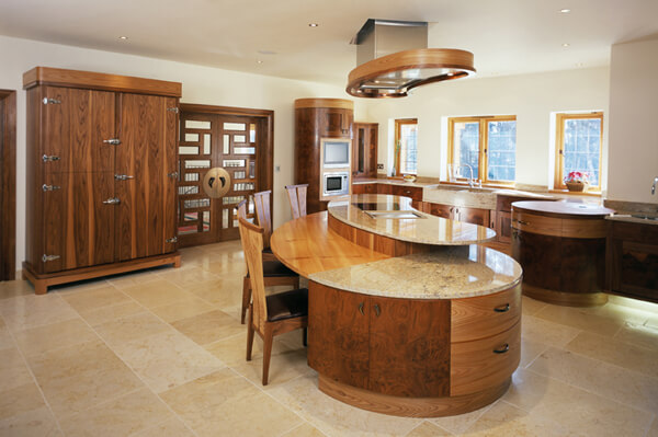
Andrew, the client came across us through a feature in ’25 Beautiful Kitchens’ magazine – of our very first kitchen project. He was a serial entreprenuer who had become increasing interested in building luxury homes. So whilst this was my second bespoke kitchen it was also his second such exclusive development – a huge 7000 sq ft house in Farnham, Surrey. He’d already commissioned a Smallbone Kitchen in his first home so was used to the ‘language’ of bespoke kitchens but found the restrictions of fitting into the ranges frustrating.
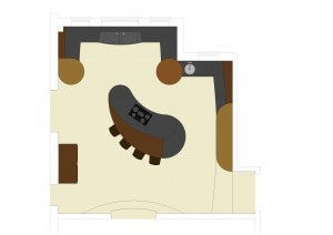 We got involved when the building was at the foundation stage, it was clearly going to be something dramatic. That’s also what he wanted for his kitchen – a big impact, with an eye on the resale value. So the brief was pretty expansive, design the most stunning kitchen possible. The space was huge which allowed me to be playful with the layout: The shape of the island, the cabinets of the oven wall and even the steps down into the kitchen from the hallway are all based on a series on circles radiating from a centre point, which is a low level drum cabinet with chopping surface. It’s not often I have the scope to be such a geometric purist.
The kitchen is adjacent to a large ‘family room’ through a set of feature glazed doors, the dining room is through another similar set. I talk about the client as a property developer but he is also a family man with a wife and two children, so that ‘wow’ factor needed to be balanced with creating a practical series of spaces with the kitchen being its functional core.
 After lots of playing with different timber combinations we produced some sample cabinet fronts – something we always do on a project like this. It was decided that black walnut and elm would be the main woods, but even within this we were looking for timbers and veneers with very specific grain and colour qualities. This involves actually going and selecting in the timber yards. It’s something we just do to get the detail spot on. As well as the main timbers we were also on the look out for a burr American black walnut, but something that had a large open swirling character rather than a busy intense burr, these open burrs are known as ‘clusters’. The granite and floor stone were of course given the same level of consideration.
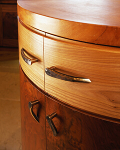
The handles are also worth mentioning. Commissioned from a blacksmith called Ged Kennett in Somerset they are completely unique. Designed by Ged, myself and Andrew in hammered bronze to compliment the colour and texture palette of the kitchen. Ged ended up doing most of the door handles in the house, and there were lots of them! I do really enjoy working with other craftspeople and designers who are aiming at the same level of excellence as we do and a huge buzz to find people on the same wave length.
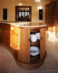 Although not the geometric centre of the space the island is the real heart of the room – it is probably the most complex one from a design and making perspective I ever attempted. It’s all curves – not a flat panel to be seen. In terms of what’s in it – well lots of storage behind big curved doors, a pair of large pan drawers and at the narrow end of the piece a crockery carousel with a beautifully engineered push stop button that avoids it spinning like a washing machine. Instead of doors we used a vertical sliding tambor. It looked stunning. The back face has a low (750mm) breakfast bar work surface in hand-cut elm veneer which blends subtly with the Kashmir Gold granite that it meets. On the higher level the same granite forms a symetrical kidney shape surface, broken only by the ultra minimal induction hob.
The kitchen is properly loaded with appliances – mostly Gaggeneau with the exception of the fridge and dishwahers, but i’ll come to those later. The most striking appliance is the bespoke overhead canopy extractor which follows the same kidney form as the island’s top level. Within this is a Westin custom made extractor fan. We fitted the motor to the outside of the house so it runs virtually silent inside.
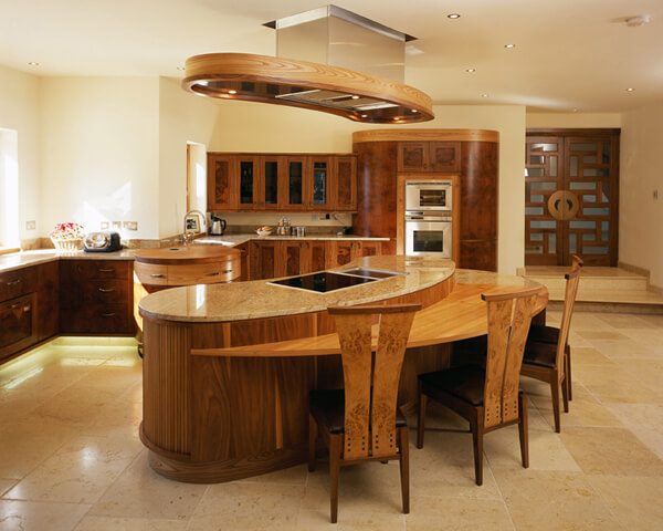
The low level units around the outside are mostly subtly curved and have a slightly higher and deeper than normal plinth. This was faced with a cream limestone like the floor tiles and underlit. This created the sense that the units were floating which looked wonderful, especially in the evening when the task lighting was tuned down.
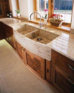 One feature I really love is the sink run. We got Stone Circle, our granite supplier to build us a double sink with a curved front in the same Kashmir Gold granite as the worktops. That front curve was difficult to source because it came out of a long 250mm square section, not your normal 30mm or 40mm slabs that come in as worktop material. It’s a real triumph but by far the most lavish sink I’ve ever designed for one of my kitchens. Either side of it is a single Fisher & Paykel drawer dishwasher. In the same run are a series of tray slots – another great little detail.
You will notice in the opening image a large freestanding cupboard with oversize handles and hinges. It looks like they belong on a bank safe from the 1950’s. That big cabinet is in fact the fridge freezer, containing Leibherr side by sides. It’s big and bold, but again this space can take it. We carried the cornice detail from the the tall oven and drum units, although we selected different walnuts to give this piece its own distinct character, aided by those big chrome handles and the hardware.
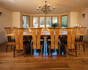 I mentioned the dining room, but what I didn’t say is that we also designed a spectacular large dining table to seat 12-14 with a completely new chair to match. The set was in oak, burr oak and walnut. If the chair looks kind of familiar that’s because we have just launched the ‘Gabriel Chair’ a direct refinement of this design. Some of the chairs migrated to the island breakfast bar as there were 14 made.
It was a really exceptional commission and for many years our flagship kitchen, it remains a benchmark commission for us today. I should say that while I designed it, it was made at Halstock Cabinet Makers, whom I worked very closely with for many years. At the time my own workshops were too small to do this kind of work, something we have now resolved by moving to larger premises at Briantspuddle, Dorset in 2007. We now design and make all our kitchens and interior projects ‘in-house’.
The client was over the moon with the end results. Although all the house was given the same treatment of quality, design and sometimes sheer quirkiness, the kitchen space remains something both he and I are very proud of.