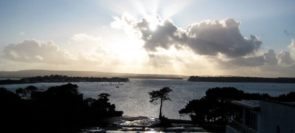
So is this the best view in Dorset? Well it’s probably up there. A fantastic panorama across Poole harbour, Sandbanks and Brownsea Island across to the Purbeck Hills. The sky is dramatic and a single kite surfer adds a bit of primary colour. This is what my clients look out on every day, but when they turnaround and see what’s on the inside of their home the view’s not bad either!
Sandbanks has become a playground for the rich and famous, becoming its own glamourous self-perpetuating myth. To be blunt it’s a slightly surreal place lots of the time, but you can’t get away from the natural beauty and drama that underpins it all.
Over the decades there have been many great buildings put up (although there are a lot more bad ones in truth) and there are some really stunning Art Deco buildings among them. The one that the clients live in is a local landmark by modernist architects A J Seal and Partners in the mid 30’s. This residential block was renovated and modernised in the 1990’s, it was done fairly sensitively and the original building retains its character and many of its original features. I actually went to look around the penthouse show flat at the time, out of intrigue more than anything, but I did want to have a look at that fantastic stairwell. Little did I know that 15 years later I would be redesigning most of the interior in that very show flat.
I had just finished a big kitchen project down the road and the architects that worked on that job recommended us. We got on well and were soon asked to come up with proposals for a completely new kitchen and lots of free standing furniture for the living area. An exciting brief and lots of work.
We started with the kitchen. Despite being a luxury penthouse in a pretty high-brow location the quality of what was fitted in the renovation was truly miserable, both in terms of design and quality. It does upset me that just because it’s Sandbanks developers don’t feel the need to try, getting away with specifying the minimum seems like a way of life down here. I’ve seen some horrid things, in some of the most prestigious houses, this was no exception.
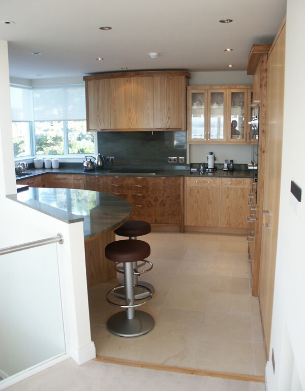
There were some structural changes being made, making the place more open and letting more light in. The kitchen space was a tight one and a difficult shape, wrapping round a curved stairwell wall, to be honest there was not much we could do with the general layout of where things went. But we could make it look and work a thousand times better, have sensitivity to the architecture and make the most of the environment it sits in. That’s kind of a no-brainer.

The clients wanted a light palette of timbers and textures that fitted with the deco aesthetic. That timber palette runs through all the furniture in the connected living, dining and kitchen space on the top floor. We used ripple ash, burr oak, native elm and a very rare burr sycamore in varying combinations to great effect. The colours used in the space were neutrals, blues and greens that reflected the maritime location rather than clashing with it.
The kitchen granite worksurfaces are a subtle green stone called ‘Wild West Green’ . The breakfast bar is in that material and wraps around the now open stairwell, connecting the kitchen to the rest of the space. Before you would have felt very cut off from any social activity and the views.


It had to be very compact, but we still fitted in every possible modern appliance, including washing machine, tumble dryer, dishwasher, double sink, waste disposal, filtered water tap, induction hob, extractor, fridge freezer and amazingly 4 Miele ovens (conventional / steam / microwave-combi and a plate warming drawer). We had to maximise storage and make the most of every space. For example, the space next to the oven unit has bi-fold doors which hide a utility area. In this tiny space are the boiler, washing machine and dryer, as well as all those awkward things like ironing boards and the associated paraphernalia of laundry.
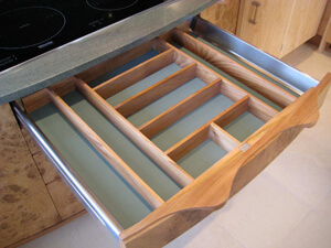
We used the burr oak as the dark material on feature units with curves, but also on the oven cabinet pan drawers which were 120cm wide. Instead of using a mono-tonal oak to go with the burr oak we used elm instead. It is similar in tone to oak, but has a much more interesting grain and colour – with silvers, reds, browns and a distinctive green stripe running through it. Elm is getting harder to find and it is certainly not something you you find in a high street kitchen showroom. Even the more high-brow Smallbone or Mark Wilkinson’s would stay clear of it as it is hard to use, hard to source and it is inconsistant from one tree to the next. For this reason we tend to buy whole logs for one job. The more straightforward doors and drawers were made with ripple ash, another wonderful native timber we don’t seem to make the most of in this country.


The area by the sink has a corner glazed window which lets lots of natural light into the space. The kitchen is light, airy and simple, especially when you consider how much we crammed into it.
But it is also worth mentioning the details like the specially designed deco influenced stainless steel and timber handles which compliment the timber on each piece of furniture, or the detail grills on doors and plinths. Everything has been thought about in great detail, which makes every detail great.
The next piece of furniture you come across is a fitted corner cabinet with curved elm doors top and bottom and a lit centre display area in burr oak. This space was designed to show a Lalique glass vase. The cabinet is the soft transition, both in form and aesthetics, from the kitchen and stairwell area into the main living space. It’s a lovely piece that works on all sorts of levels.
At this point the room opens up with the well restored ribbon windows that run floor to ceiling, letting lots of that coastal light right in. Within the space we designed and made a very 1930’s inspired dining table and chairs in ash and burr sycamore, the large media and display cabinet at the far end of the room, a sideboard and a set of double doors with glazed deco panels within.

The glass was done by Opus Glass Design in Bristol who the clients had used previously for a glazed door in another property. It completely worked in the context of the flat, but also with the tones and texture of the elm frame.
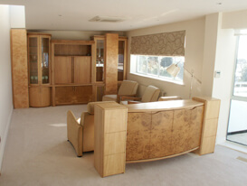
As a stand alone piece of furniture the curved fronted sideboard is my favorite piece of all. It also acts as a room divide between the soft seating area with the views out over Poole Harbour and the TV area. I love the contrast between the ripple ash cube end sections and the raised curved burr oak doors in the centre. Because it lives in the centre of the room it had to look as good from the back as well, so no skimping on materials there.


The media and display cabinet at the end of the room hides the TV behind a sliding tambor screen. It’s a neat and is a very period solution. All the other technology is hidden down below in the centre bottom cupboards. The ceiling slopes slightly right to left to allow run off on the flat roof above. To make this less visually obvious I designed these cabinets to have an abstract and unsymetrical appearance, a bit like an unplanned city skyline. The lit display sections have curved glass within and glazed shelves. The two large ‘tower’ pieces are in burr sycamore and contain mostly DVD and CD storage. It was a very complex piece to make and took almost as long as the kitchen.
I’m never one to try and fill a space with my work, I like having other objects around and even furniture by other makers. Too much of the same can make a space appear a ‘flat’ and overworked. However, I think because of the subtle palette and consistant changes in use of materials across the pieces this space looks as fresh and exciting as the day we finished it in 2010.