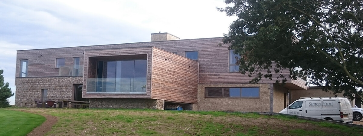
In late February we moved the whole STP team from Dorset to the North Norfolk coast for the first stage of our Bliss Blakeney fit. This amazing project sees us collaborate closely with the Bliss Space team to create striking interiors for this most stunning contemporary home. Over the course of the next months we will be returning regularly to fit the kitchen, larder, living space, bar, dressing rooms and other fitted and free-standing bespoke furniture throughout the house.
What I really love about working on this project is that the clients are so visionary and brave about what they want. It’s a very creative partnership that is leading to dramatic design solutions and a whole new language that keys into the architecture of the building and its surrounding landscape.
Bliss Blakeney is a sleek low profile CLT (cross laminated timber) structure which is built around a central courtyard overlooking the Norfolk salt marshes, Blakeney Harbour and the North Sea. Despite being a very modern building in an area dominated by more vernacular traditional flint cobble buildings, Bliss sits in this big panoramic landscape beautifully. It is quite frankly a bit of a masterpiece. So the bar was raised for us – not only by the clients, but the building and the environment itself.
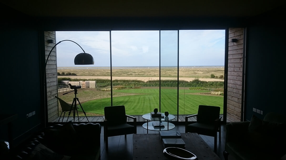
The call from Daniel & Lisa Broch, owners of Bliss came out of the blue, they had found our website and video work and liked what we did, although they made it very clear from the outset they were not looking for furniture and interiors that looked like anything we had done before. For me as a designer and the whole making team this is exciting to hear. Although we love all the work we do we know that it is when we are pushed creatively that we come up with our most exciting ideas, ideas that move the business forward into new directions. From the first meetings, initial design concepts and material palettes we knew Bliss Blakeney was going to be hugely exciting…
Stage 1 was to tackle the stairwell walls and open upstairs library / comfy area. Now wall panels on the stairs may not sound the most exciting place to start, but these are no ordinary panels. The brief was ‘architectural scale Mondrian’, and when we talk scale we are talking two walls – the largest being nearly 7 metres high and 3 metres wide. To create something that appears so simple, as is so often the case, is anything but…
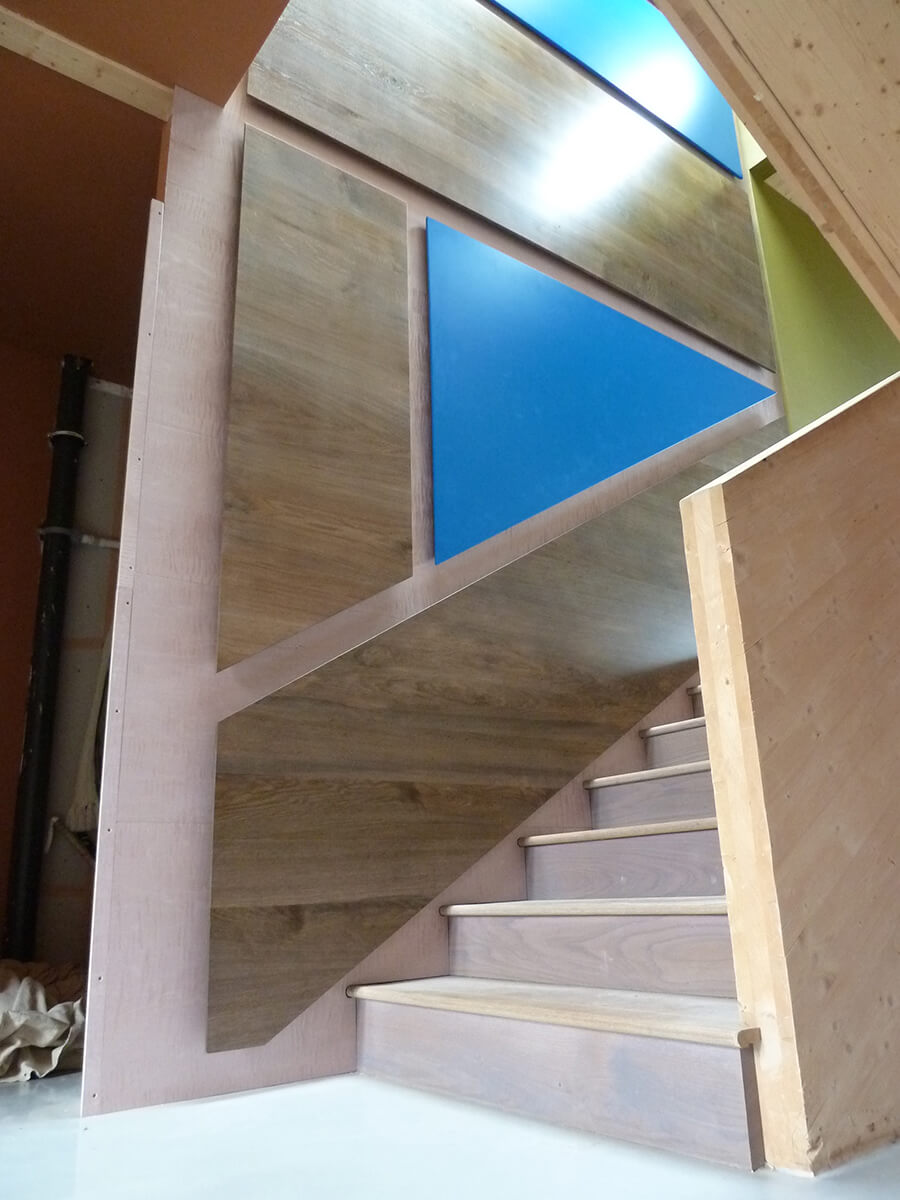
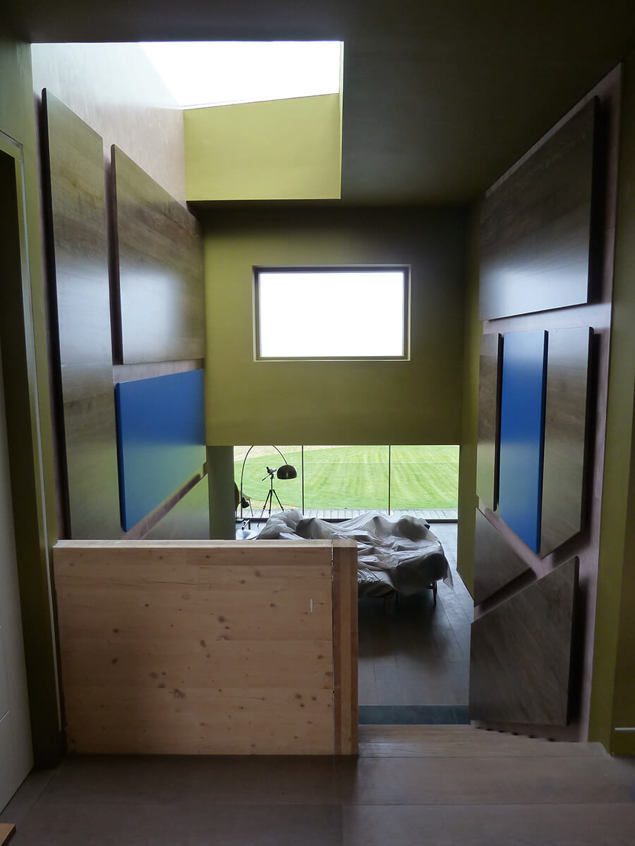
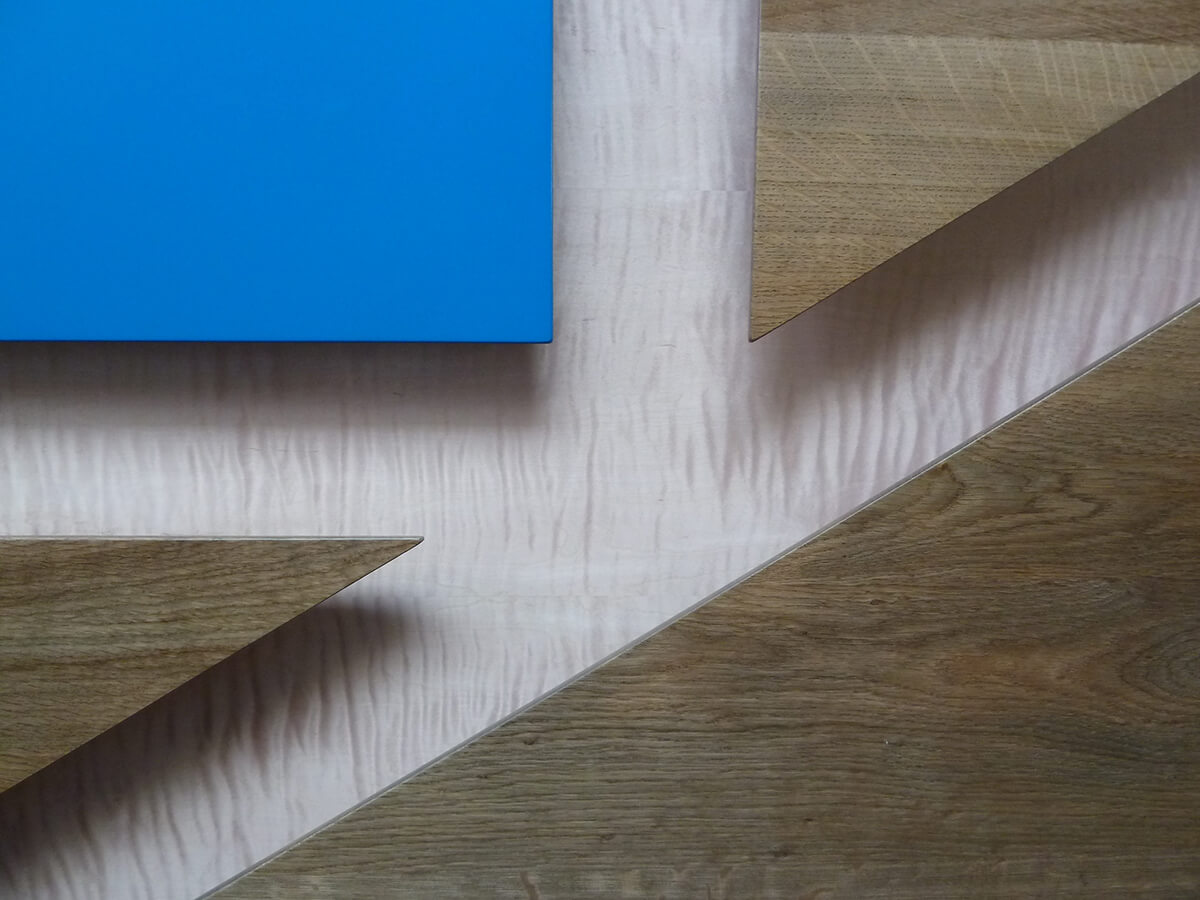
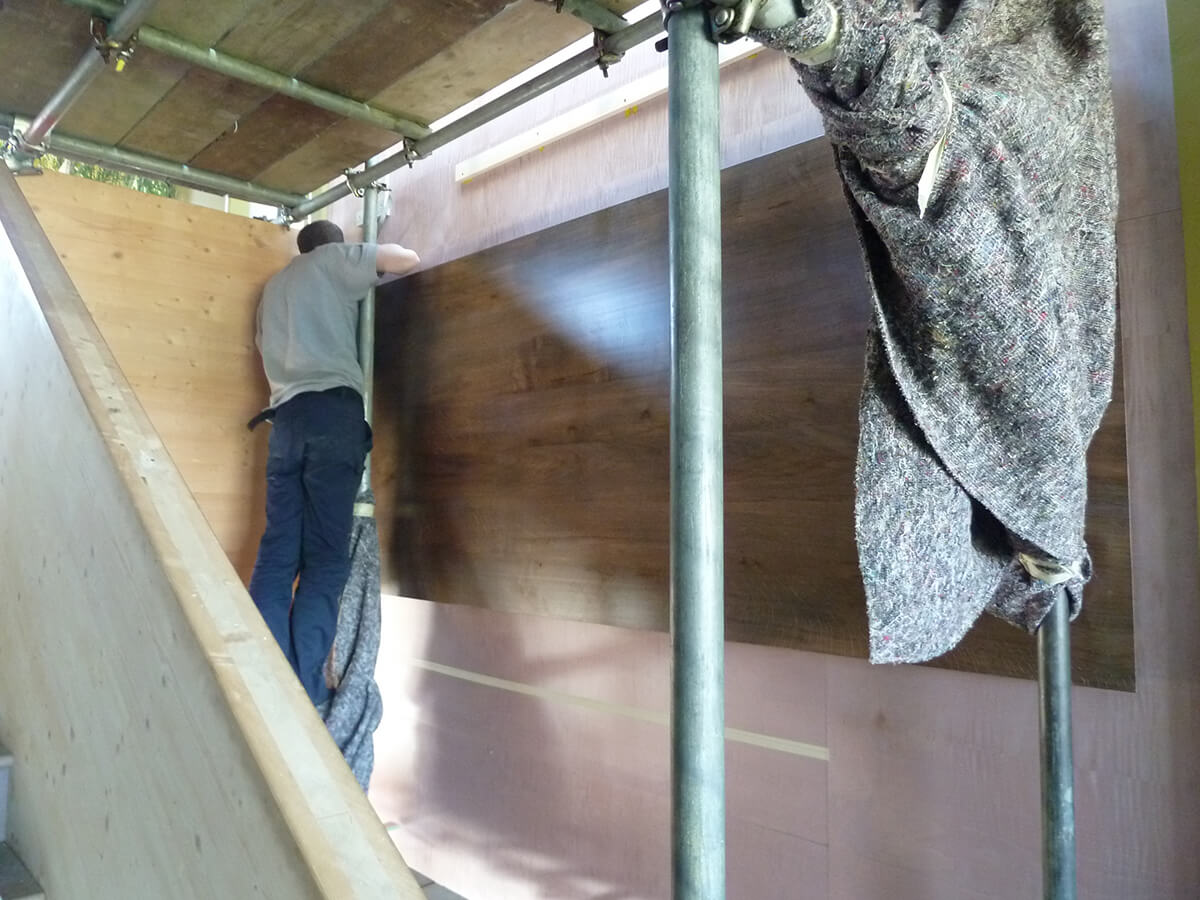
Firstly we had to attach hardwood frames to the CLT walls and straighten any misalignments out, then attach the panels with the pink ripple sycamore veneer on as the background layer then invisibly hang the decorative surface panels onto it. Most of the surface panels are made of solid oak and treated with a fuming product that turns the oak a subtle grey, with the exception of 3 which are a strong flat vibrant blue colour. The largest of these is the size of a very generous 12 seat dining table top, which of course went near the top! Needless to say the logistics of this involved lots of muscle and some brilliant scaffolders who built stuff as we needed but more importantly took it down as well. It did take us the full 3 and a half days on site to build, but looked stunning when the scaffold finally came down on Thursday evening.
Of course most of the preparation and making had been done in the weeks and months before back in Dorset, although we only ever really see these large interior assemblies together for the first time when the clients do – as fitting ends. Up till then it had been a kit of rather large parts taking up more and more of the office and workshop. The stair panels and library, together with most of the workshop tools ended up filling our 2 vans plus a large luton for our Monday morning convoy to Norfolk. That first day was spent loading, driving and unloading again. It’s a glamorous job sometimes!
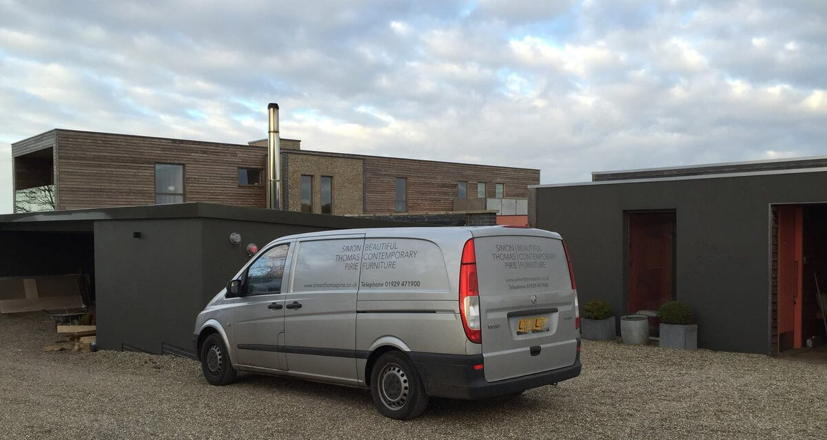
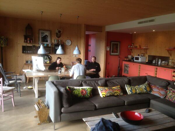
That was made up for by our accommodation for the week. Part of the Bliss Blakeney complex is an attached but self-contained luxury 4 bed ‘Cabin’ which provides four bedroom suites all with direct access to gardens, a great Master Suite with private deck and feature bath and open living area leading to deck and garden. The generous living and kitchen space became our chilling space after a long day but also doubled up as my impromptu office to work on drawings etc. We planned to take turns cooking but with so many great pubs around we only managed on 2 of the 4 nights. Having our own comfortable space on site really makes the situation easy and enjoyable.
As well as the stair wall panels we were also building the contemporary library at the top of the stairs. Together with Daniel & Lisa we came up with a very abstract design for this piece. Although I call it a library, in reality it also serves as a media wall, snug area, filing and samples drawer cupboard and general storage. As with everything on this project the scale is large. Even after all these years sometimes scale still catches me out. It was only when I walked into the workshop and looked at the two 2.8m tall floor to ceiling cabinets that it hit me as to how large this element of the project was.
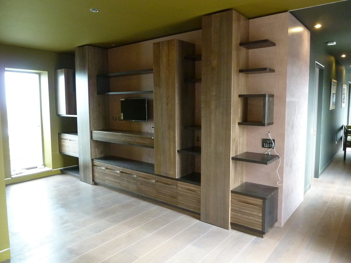
The pink ripple sycamore panels as the background element tie the library visually to the stairs, as does the other common material – the fumed grey oak on the cabinets and drawers. The 3rd material is another coloured ripple sycamore – this time a grey / black for all the horizontal shelves. Like the stairs we also had to straighten the walls with timber frames first, then panel in the pink sycamore before we could construct the ‘furniture’ on the front. The design of the library relies on everything being completely true and square. In the end it took John and I two days to get the panels to sit correctly. We had anticipated getting the whole library up in two days then be helping out Mike and Tom on the stairs. Just goes to show that when fitting nothing ever goes quite to plan.
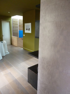 The pink also runs around a corner creating a ‘wall wrap’ detail. Again this was to integrate the furniture with the interior architecture but also meant we needed to create perfect mitre joints on site (it’s hard enough in the controlled environment of a workshop!) For all its difficulty to achieve as a detail though, it is a visual triumph and something that we will repeat as a theme throughout the project.
When we left it still needed the electrics and AV equipment installed, as well as having the pink sycamore facia TV panel added, but it has really started to come into it’s own when dressed with books, lights and other objects. It was designed to be used and to be useful. There is so much going on here I can’t choose a favourite element – I love the material / colour contrasts, the fold down front where the AV equipment is housed and the repeat horizontal detail and recess handles on the drawers. But I keep coming back to that pink corner wrap and it’s not even a piece of furniture!
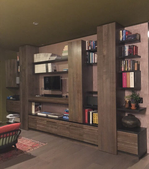
And Lisa Broch’s take on what we have done already…
“The Library looks amazing and feels like it has always been here which is a bit of a weird feeling, but just means we are all in tune with this house.The staircase is a piece of art. Very excited about the next chapter”.
Perhaps the real surprise to me is the stair wall panels themselves though. I got wrapped up in the detail of the design and then the fitting of the library so wasn’t paying much attention to the stair walls. It was only on Friday morning when it really hit me as to how stunning the whole thing is; it’s sheer scale, the way it catches and reflects the light around the space, its relationship to the landscapes and sky through the glass openings around it and the fact you touch and interact with it as the handrails on both flights of stairs.
There are lots more great design ideas and new materials to come on this project, but i’m wondering if in a year’s time it will still be those stair wall and handrail panels that are my favourite element.
