In December 2016 we received a call out of the blue from a construction manager we had worked with very successfully on the ACE Sandbanks Penthouse project. He thought we were the right designer-makers to be helping on his latest build in the New Forest National Park. Initially it was only to complete a high-end home office, but it soon became much more than that.
This extraordinary contemporary home was originally conceived by John Pardey Architects, but by the time we were involved we were collaborating with the new construction team and new architects – Bright Space Architects. The project had renewed momentum emphasised by the client appointing internationally renowned interior design studio Lázaro Rosa Violán from Barcelona. We worked closely with Cristina Nogué from LRV to oversee the interiors. Although we were last into the mix this was going to be a very exciting collaboration with a decent budget but a tight timeframe.
Ironically, although the study was the first room we designed it ended up being the last room we completed as other complex and beautifully detailed elements were handed over to us to detail and cost. In the end we had involvement in most of the bedrooms including the principle suite furniture, as well as lots of storage / display alcoves throughout the space. We also completed large hinged mirrors in the gym and hundreds of square metres of stunning slatted wall panelling in the main curved hallway and other rooms.
Lots of this was new territory to us, but as a design and make studio we love a challenge. The level of detail required by client and interior designers throughout this project was always demanding, but they were an absolute pleasure to work for.

In many ways the most striking interior feature of this house is the 36 metre slatted timber-clad curved wall that immediately confronts you as you walk into the house. This is the central linking corridor through the whole house and has a curved ribbon of skylights at the top throwing natural light down the 4 metre high vertical slats.
Every one of those 900 individually machined and sanded slats had to be fixed to a plywood former which had to be perfectly true for the visual magic to work. There were doors and linings to produce that had to align perfectly to the rhythm of the 30mm raised slat and 10mm shadow line. As with all visual minimal design it’s much harder to achieve than you might think.
The timber is this instance was Utile, which we used because of its warm rich red-brown colour and texture. We tend to steer clear of tropical timbers whenever possible but this house had real retro 60s vibe about it and nothing else really worked in capturing that look. Needless to say we ensured the timber came from sustainable well-managed resources but we never take the issue of using tropical of timbers lightly. Given the choice we will try to use a British, European or North American timber. However nothing from those regions comes close to that 60s look or colour you get from timber of African or South American origin.
A detailed description of this and other panelling projects we have completed can be found in our Designer’s Journal blog post, “Contemporary Wooden Panelling.”

The slats from this ribbon of curved wall flow through the end of the hallway into the gym and cover two further walls there. The same material was used in the large-scale mirrors, one of which is hinged.

We also panelled a bedroom in Imbuya. This is a timber often referred to as the ‘South American walnut’. The clients had spent a lot of time in various parts of the continent and had sourced the timber over there. Again the thinking behind this was to recreate some of the warmth and richness of interiors they had experienced in South America. There wasn’t much of it left as they had used it on the gym floor so we laminated it to a plywood to create what was effectively a laminated engineered panel. By doing this we just had enough to cover one of the smaller guest bedrooms.


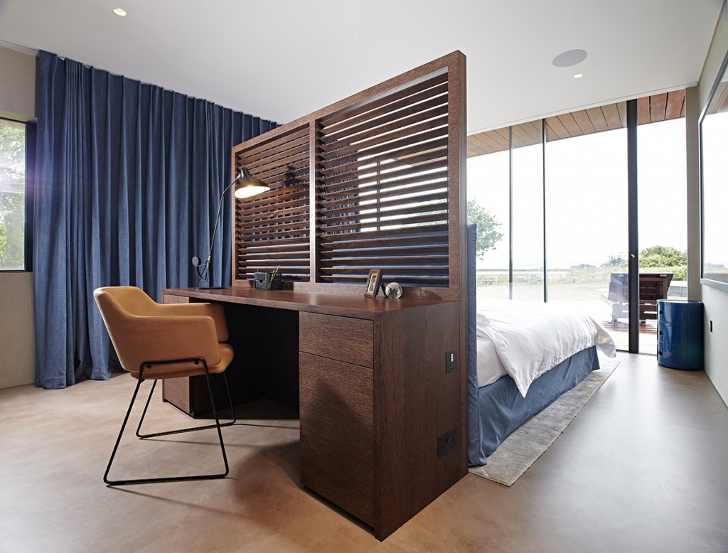
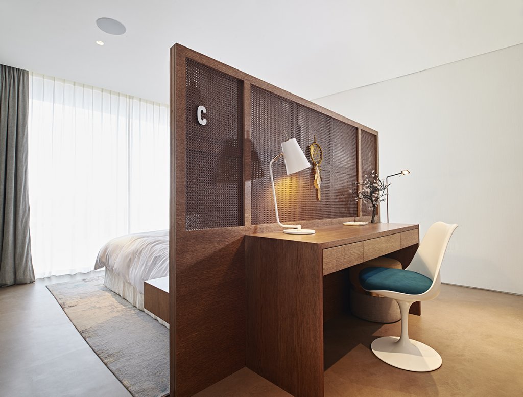
Our next challenge was headboards. In two of the bedrooms we were asked to assist in designing and making freestanding headboards with the bed and built in bedside tables on one side facing the fully glazed wall with big landscape and sea views, and a desk on the reverse. Both were similar but in different stained oak timbers with a different solution to the partially see-through screen – one having a horizontal timber slats, the other with cane wicker panels. These headboard / room divides were really successful at helping define the spaces but not over furnishing them. The bedrooms were only a modest size but retained their spacious feel as a result.

These rooms also contained sets of inset display alcoves. Again the nature of the detailing and shadow lines demanded really precise work from us and the build team. There were also alcove display spaces in the hallways and various bathrooms and for each one we created a timber box to create a frame with a textured back panel to really show-off the items on display. In the bedrooms this was done with a fabric panel; in the hall with bronzed mirror and the addition of an angled spotlight.
A fourth bedroom contained a wall-mounted headboard with shelves and bedside storage incorporated. This lovely piece was in black walnut. Like so much of the furniture we make we had to incorporate complex lighting and living home technology system switches and wiring into the design and work closely with the site teams, M&E (Mechanical and Electrical) designers and electricians. The end results are subtle and stunning though.

Apart from the feature curved wall panelling our biggest input was in the principle bedroom suite where we made all the cupboard and wardrobe storage and some matching circular bedside tables.

The impressive run of wardrobe cupboards wrapped around 3 walls, although a short run was hidden behind a stud wall as it also contained an M&E riser behind it. Made in ebonised oak which was a very dark brown, not black. It had stunning faux leather panels in orange in all the back panels. These were back lit creating a beautiful warmth and richness of tone in the room. All the cupboards with doors had LED lighting within that came on when the doors were opened. There were beautiful bronze edge handles (“Moon” by Joseph Giles) and glass fronted drawers. It is a vision of elegant opulence created by us and the Lázaro Rosa Violán Studio team.

The bedside cabinets are cylindrical drums in ebonised oak to match the wardrobes. They both have a single soft-close drawer with the same orange faux leather lining. There are power and USB sockets on the rear and the cabling for these is neatly contained in the internal void and connected to power via floor sockets hidden underneath. A control panel is inserted into the top of each cabinet from where the window coverings and all the lighting for the room can be controlled.

Interestingly this was the only first floor space we worked in. The house is effectively ‘upside down’ with the kitchen, living spaces and principle bedroom suite upstairs, while all the other bedrooms, the gym, the study, cinema room and utility are all on the ground floor. It is partly to make the most of the elevated view through the curved glass façade facing south.
The building is designed around a segment of a curve and it also had a pitched single span roof. As you can imagine this does lead to some interesting cabinet junctions and interactions with angles and openings. No more so than in the main bedroom where we had to deal with that and a row of high ribbon windows above our fitted cabinetry.
 We never did photograph the office properly because it was the one space that was still full of boxes on the day of the shoot. That’s a shame as it was my favourite room and is probably the best study we have done. The desks are very minimal with chunky Utile timber tops and bronzed metal frames. The low units that interact underneath are on heavy duty bronze plated castors and are very pared-back as well.


There is a fitted wall unit at the end of the room for files and office storage, open shelving above which is framed and contained. We are going back soon to discuss some extra furniture so I will try to get some nicer shots of this lovely work space.
It was one of our biggest projects to date and one that stretched us in all sorts of ways. At times it was hugely challenging but even when up against a tight deadline you always know when you are working on something special that will occupy a special place in the portfolio. As ever it’s about collaboration though – great client, great interior designer and great site team working together.
Images by Double Exposure Photographic