We have been extremely fortunate to have met some wonderful people through our work. Of course, clients don’t come to us if they don’t appreciate what we do and so our relationship with them always begins with the common ground of love of our design and recognition of our craft. But once in a while, you meet someone with whom you form a special bond and we have been lucky for that to have been the case with several of our former clients whom we now count as friends.
The owners of this glorious former parsonage are yet another example of this serendipity. Not only do they share the same taste in furniture design, but they have also chosen to live in the same village as Simon & Bridget, though our paths had not crossed before they found themselves needing a kitchen. We very soon discovered we had much more in common and many design questions were answered over a glass of wine or beer in the pub, or when Simon popped in on a dog walk.
“Simon did a brilliant job of teasing out our initial thoughts on the kitchen and coming up with some initial concepts that we were then able to narrow down into a final design. A process which we had been expecting to be an onerous and time-consuming challenge turned out to be a genuine pleasure and there was a real sense of excitement about what we could create. Simon always acted as a guide rather than a dictator; he was ready to provide suggestions without ever making us feel that we were being pushed towards something that we did not want.”
Mr & Mrs H
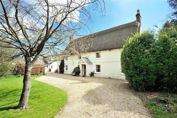
One of the largest and oldest homes in the village, the property is a former parsonage dating from the Georgian period but built very much in the vernacular. Whilst many ecclesiastical residences of that time were built to impress in the classic ‘pillars and porticos’ style copied to varying degrees of success in several modern housing estates, this is a much more modest, pared back version with white walls and steeply pitched thatched roof. Various changes and additions have been made to the house over its long history and it is not easy to tell what is original and what is not, but it retains abundant character and plenty of interesting historical details.
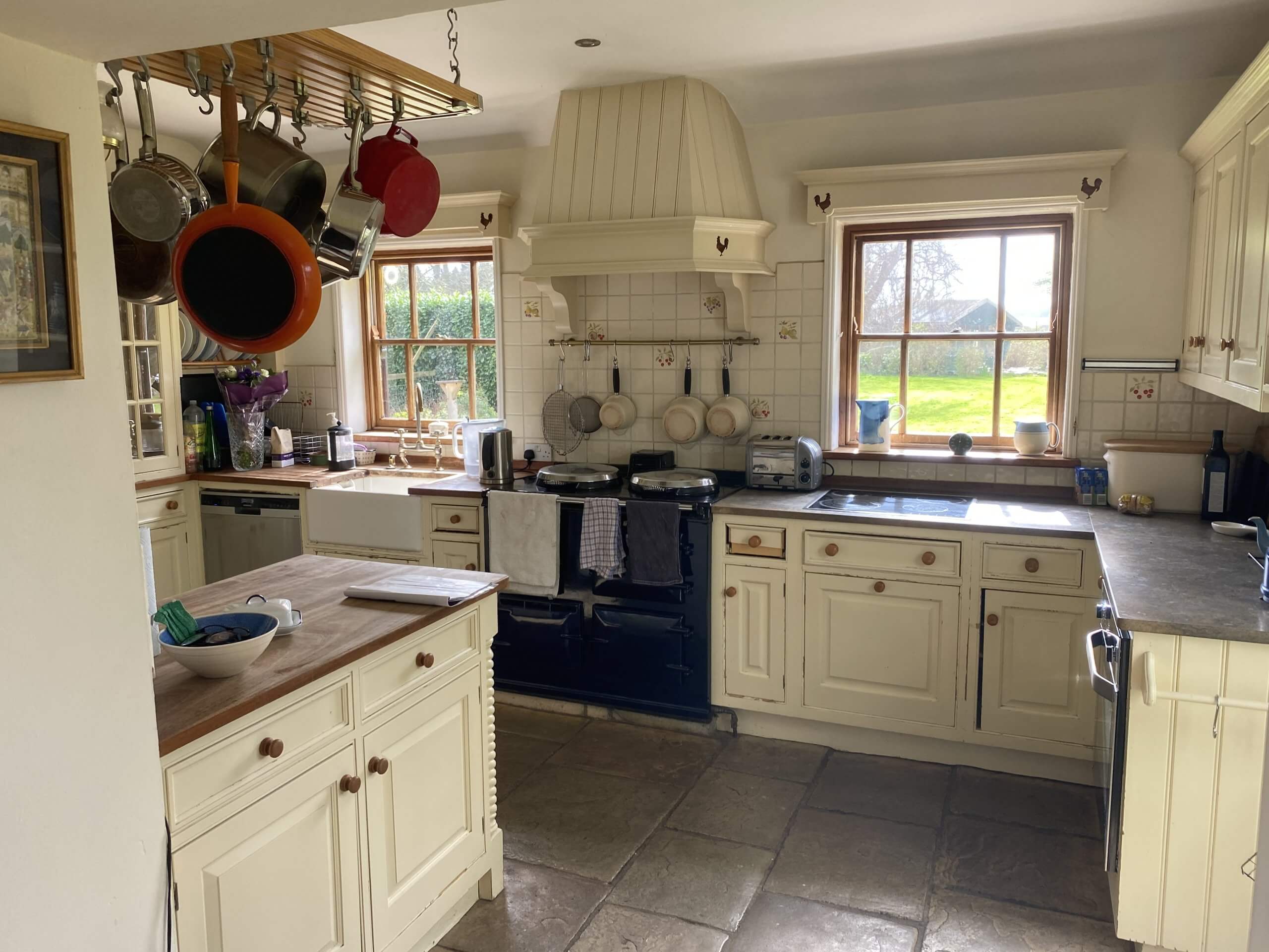
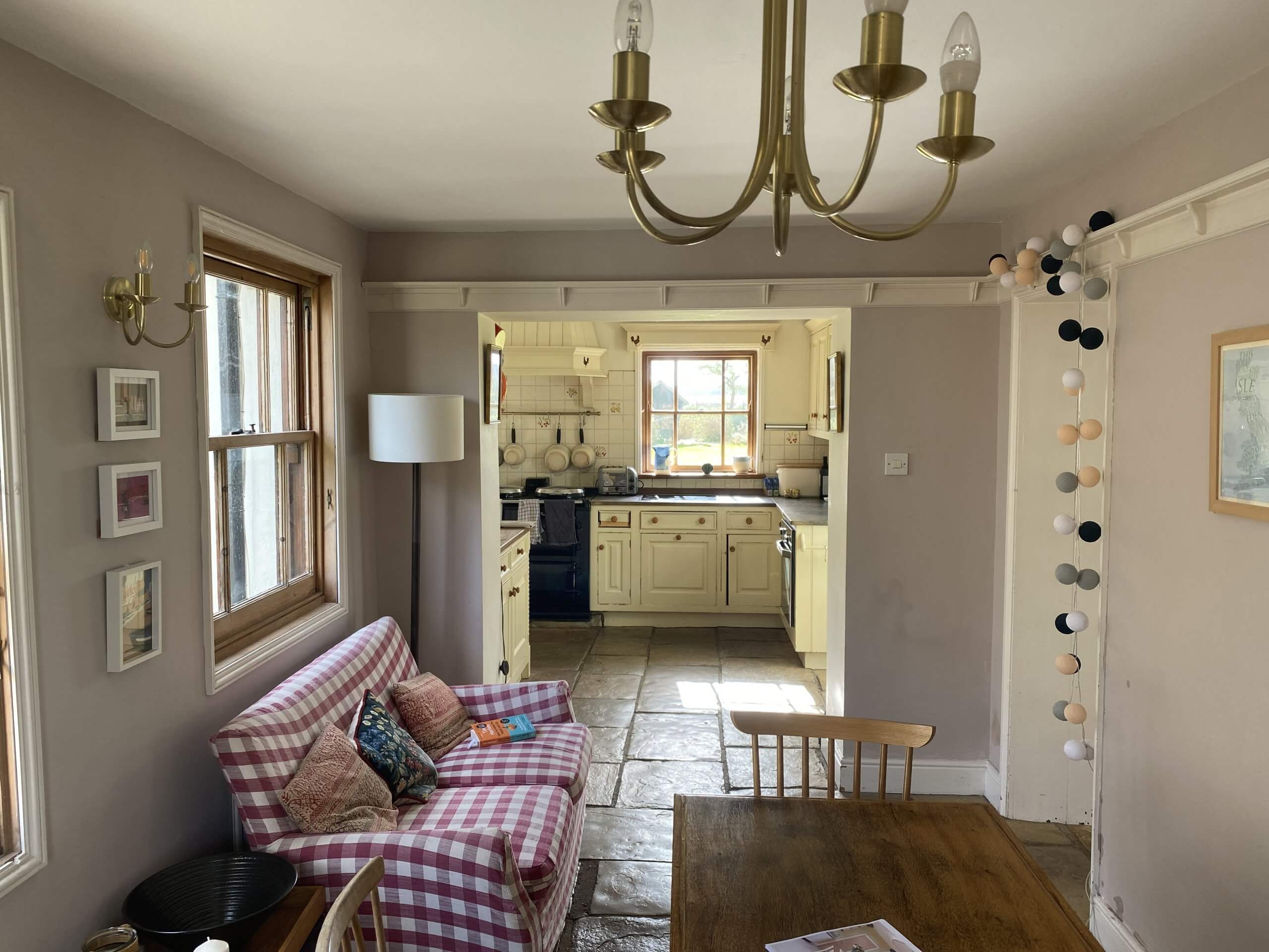
When our clients bought the property, the kitchen and adjacent dining space was small and an irregular ‘L’ shape, it felt like an after-thought that had evolved rather than something that had been planned. As sociable people who love entertaining, they needed something larger and more inclusive and by the time they had involved us they had already secured planning permission to even out the shape of the room though building work had yet to begin. The original plan was to keep the services where they were at the back of the house but to open the kitchen out by removing a wall separating it from the dining area and to push another wall out to the side to create a wider, more uniform space albeit still narrowing at one end.
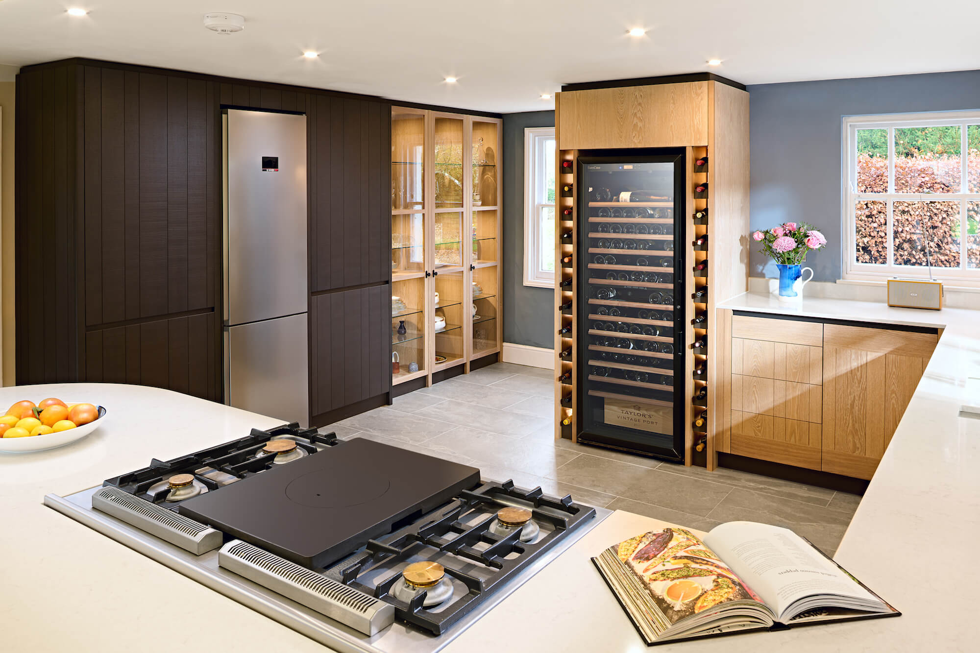
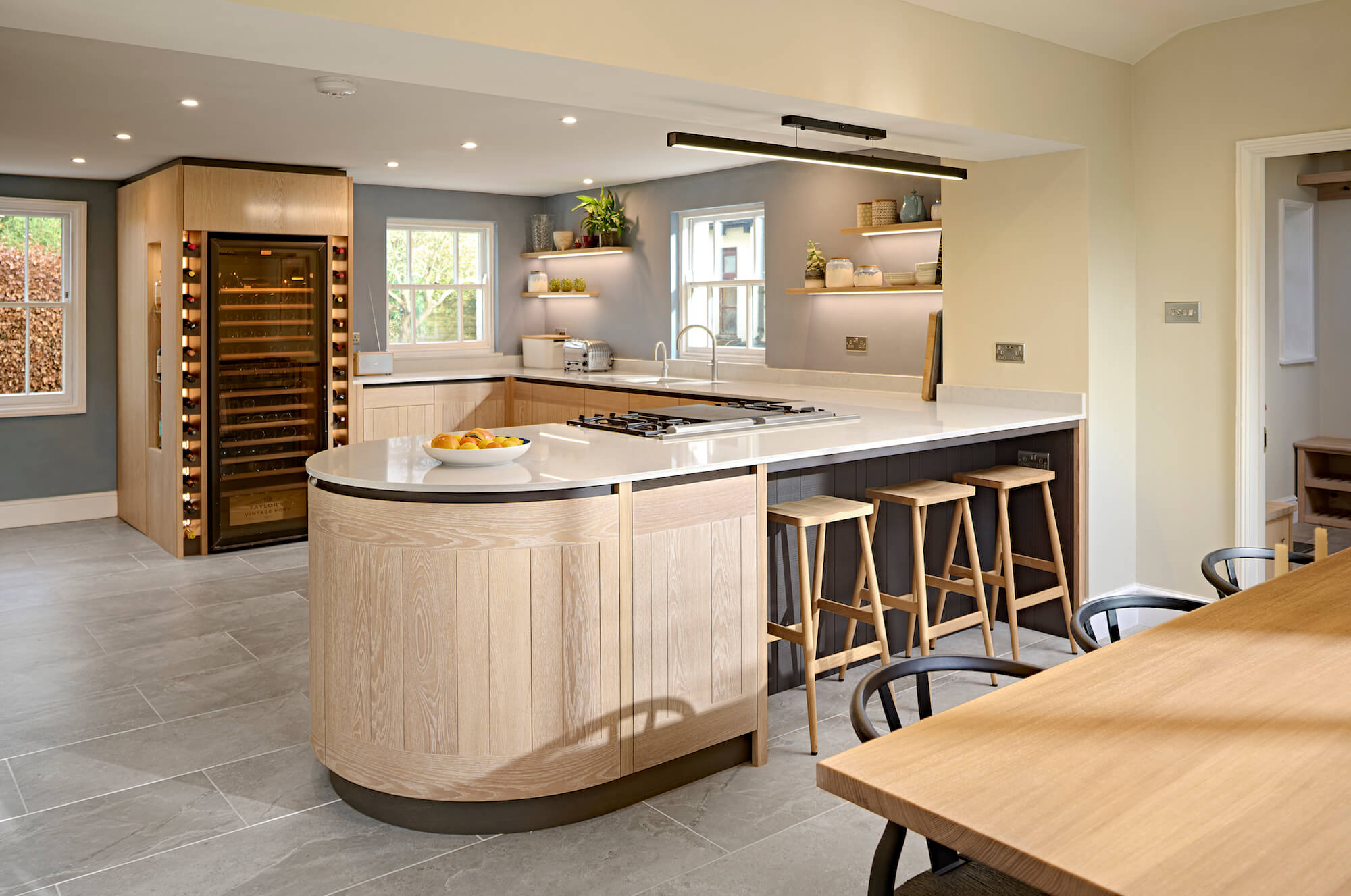
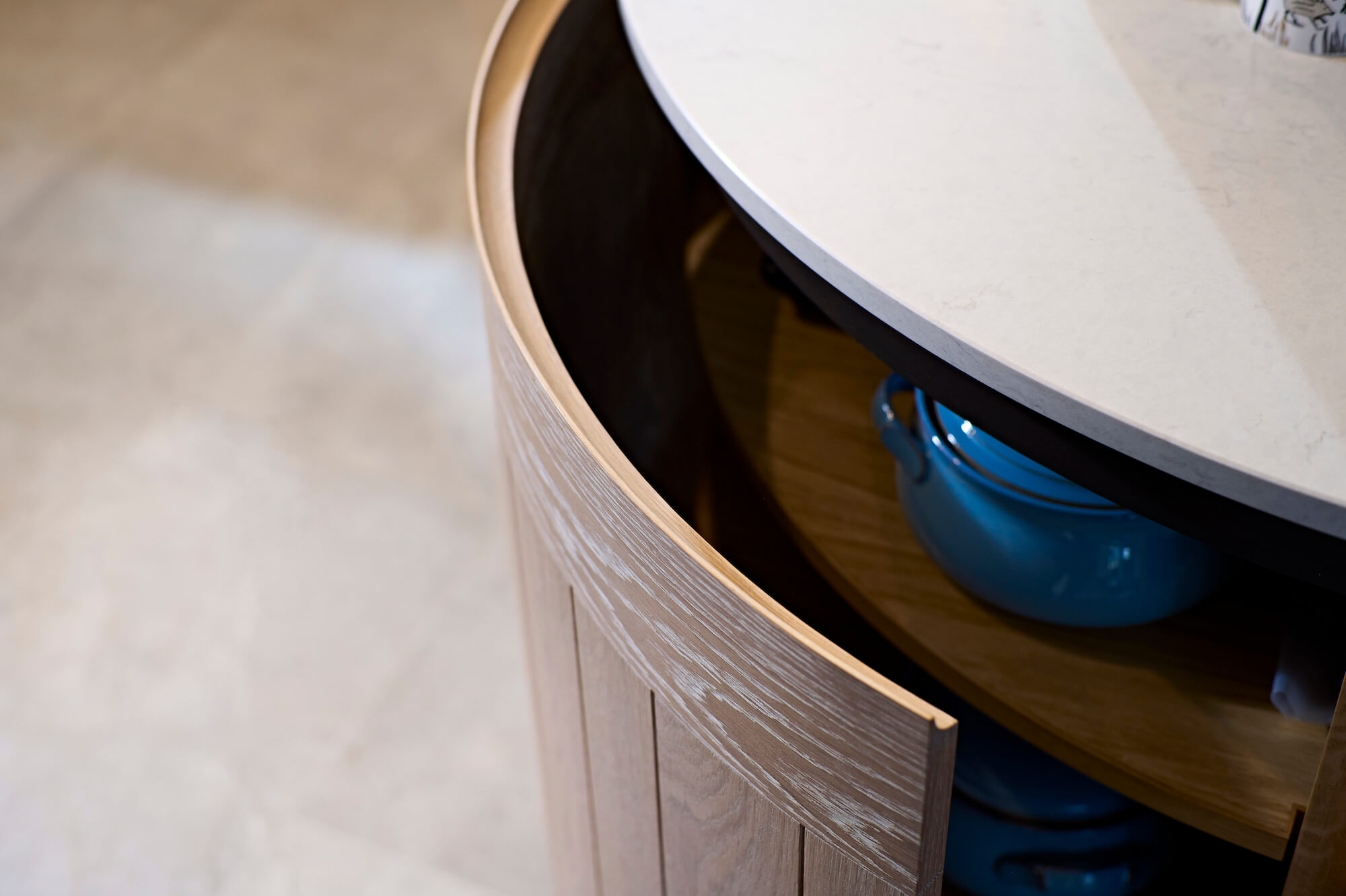
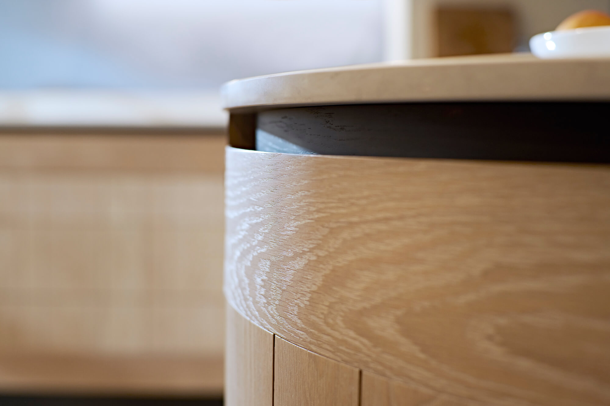
As with any old building, it offered a few challenges however, and the need to retain a large structural beam through the middle of the space as well as rectify some significant changes in floor height meant that it soon became possible to rethink the position of the water, electrics and gas. This allowed us to flip the kitchen back to front so that the dining area could now look out over the extensive and beautiful garden with doors opening out onto the patio whilst the kitchen itself fills the front and the new space to the side. Larger sash windows on the garden side were added to bring more light into the dining space. The obstacle of the low beam was addressed by abandoning ideas of a kitchen island and instead creating a peninsula with seating on one side and the Lacanche range cooker on the other, working with and making more of this potentially problematic visual divide. The ‘D’ end on the peninsula with it’s stunning curved door storage creates a soft flow into the the kitchen from the main living rooms, inviting us to move into either the working kitchen or the dining and social space, without even being conscious of making the choice.
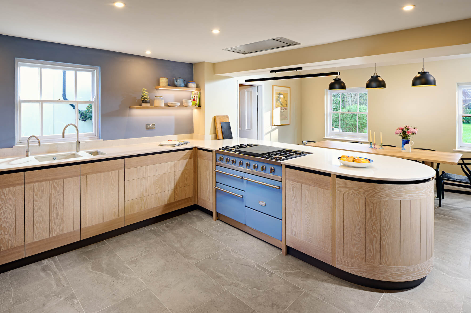
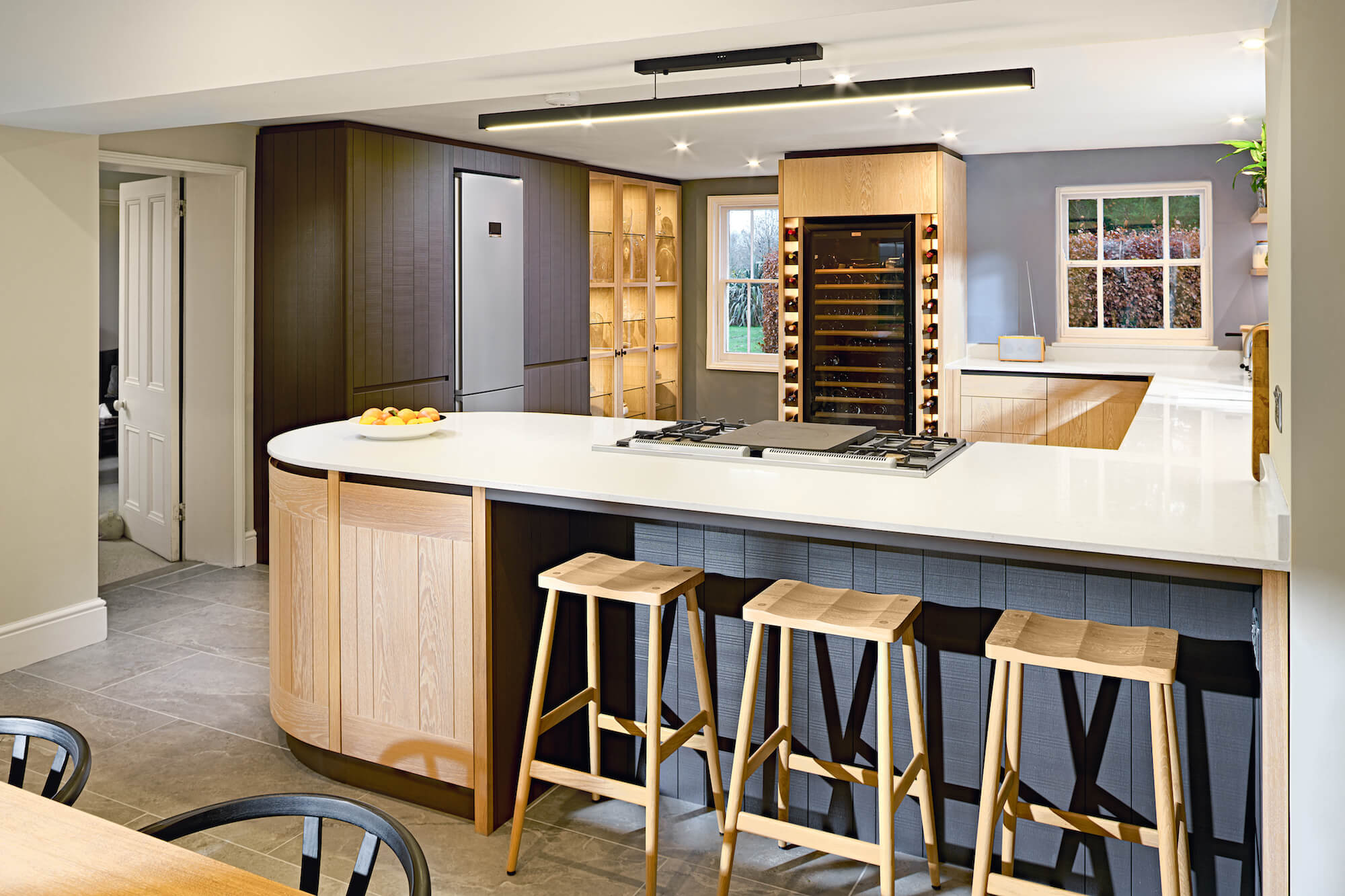
This is a very contemporary kitchen which Simon has sensitively designed to complement its rustic, historic surroundings. The clients had ideas about the style and look that they wanted to achieve. Simon took these design themes and developed them to make the very best use of the size and shape of the room. It would have been all too easy to end up with a pastiche of a Georgian kitchen, with pseudo barley twist corners, poorly proportioned mouldings and cornices and an expensive paint colour with a funky name; a large part of the British kitchen industry has played with these tired themes for decades and seems unable to move on from this entirely inaccurate representation of a Georgian kitchen which never actually existed and completely misses the point of creating a modern but historically sensitive response.
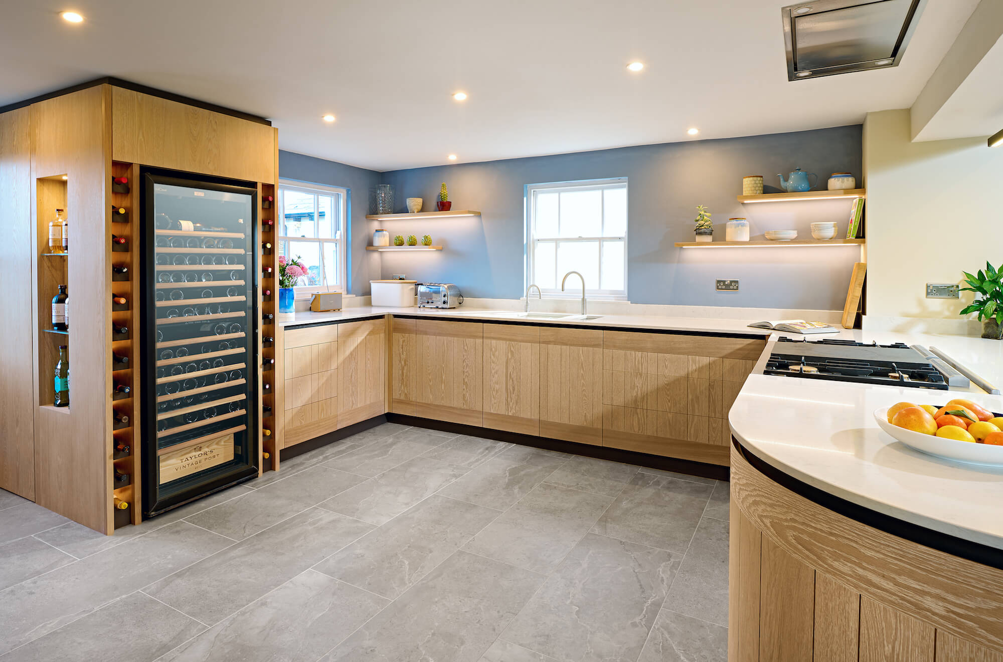
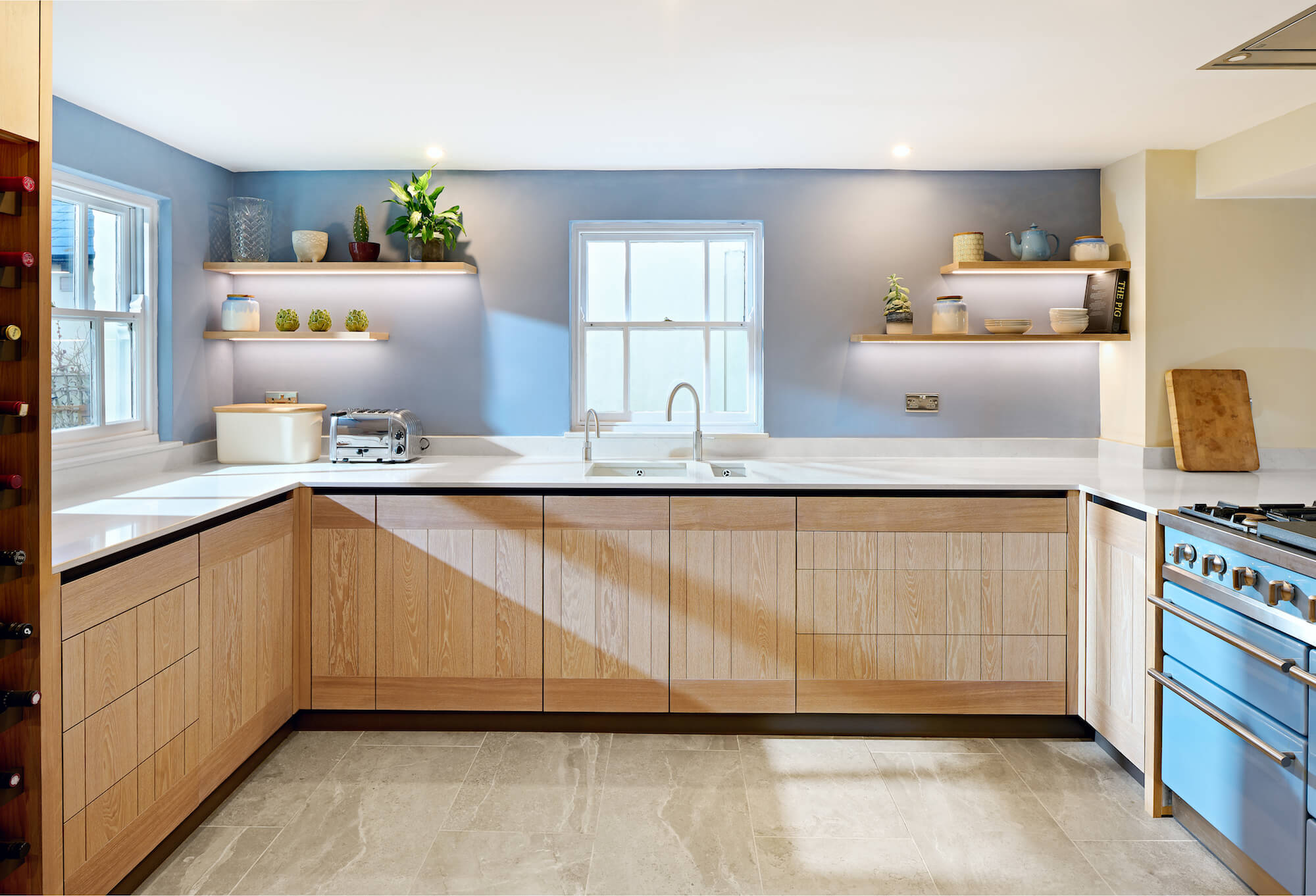
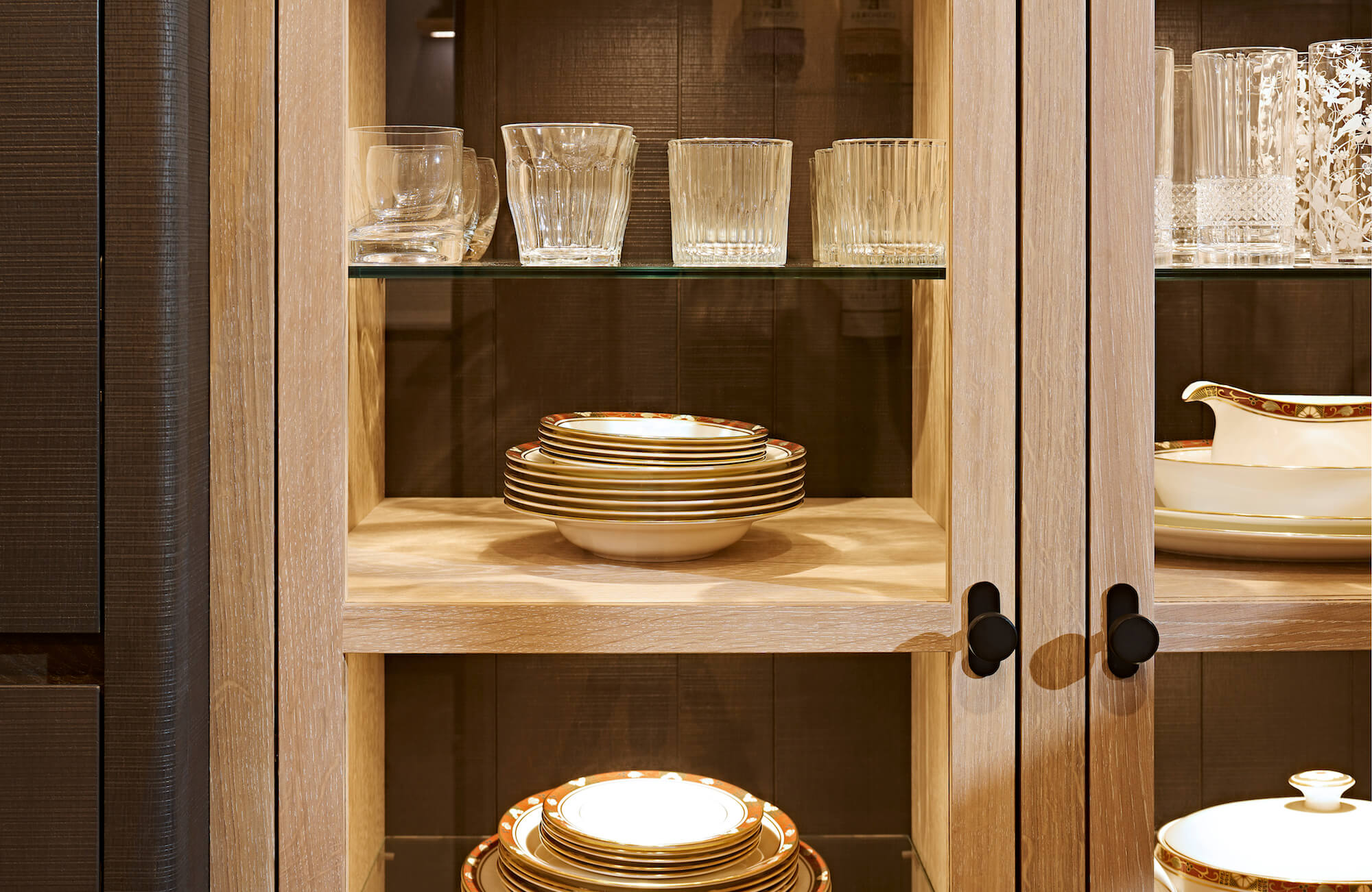
Because the ceilings are quite low compared with many of the more modern properties we have worked in, Simon was concerned not to make them feel even lower by having too many tall or wall units. A conscious decision was therefore made to keep the tall units to just one side of the room. This wall would house the tall fridge-freezer, larder cupboards and a series of large, illuminated glass-fronted cabinets designed to house crockery and tableware in the same style as you’d expect to see ‘below stairs’ in the grand properties of the period. These units run into the narrowest part of the kitchen near the front window but because of the use of glass they reflect light back into the room preventing it from feeling small or pokey.
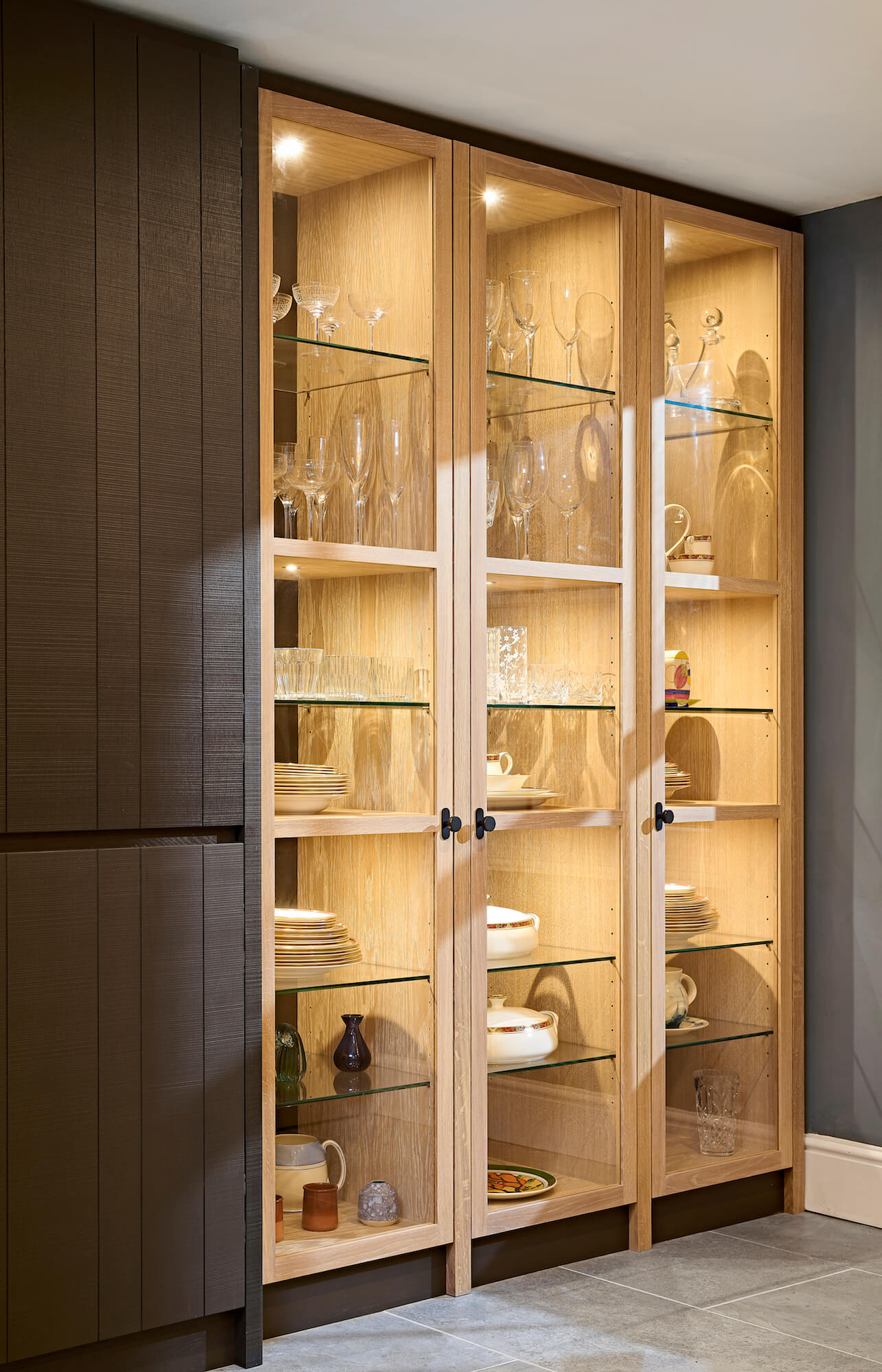
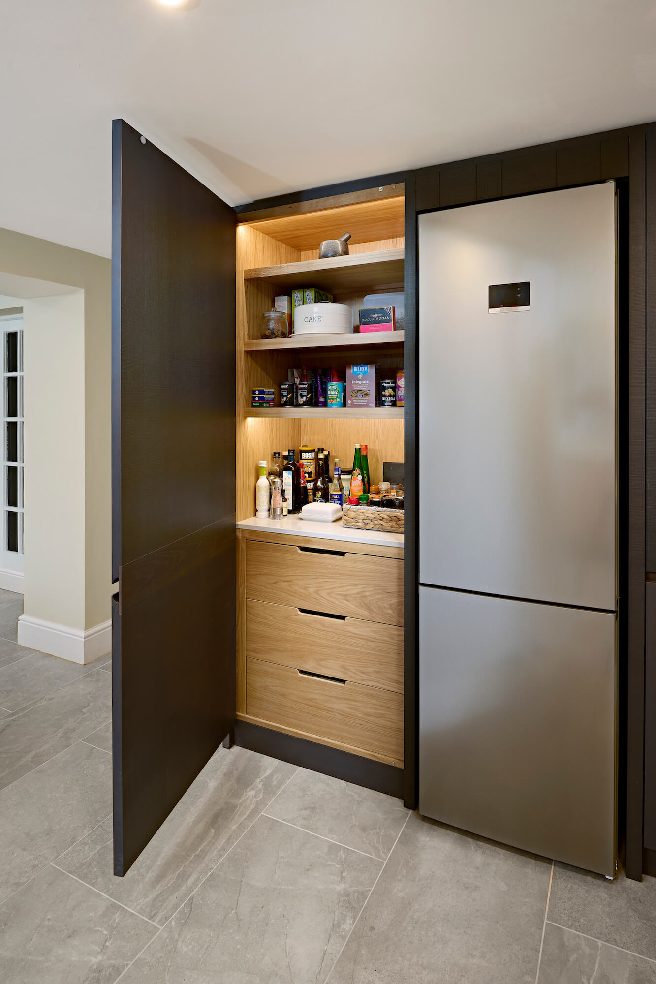
The other side of this narrow area houses the boiler which couldn’t be moved and required cabinetry to be fitted around it. Concealing this and ensuring the window appeared central to the passage, the wine storage comprising a tall fridge flanked by shelving faces back into the room. At this point the level drops to worktop height under another window, along the new wall below another window and around and along the peninsula. The sink, dishwasher and range cooker are all positioned carefully within this run ensuring sufficient work space for food preparation and handy storage of all the necessary equipment. Light coloured Snowy Ibiza Silestone was chosen for the work tops in order reflect light from the windows up and out into the room, while open illuminated shelving on either side of the window provides visual interest and storage without lowering the feel of the ceiling.
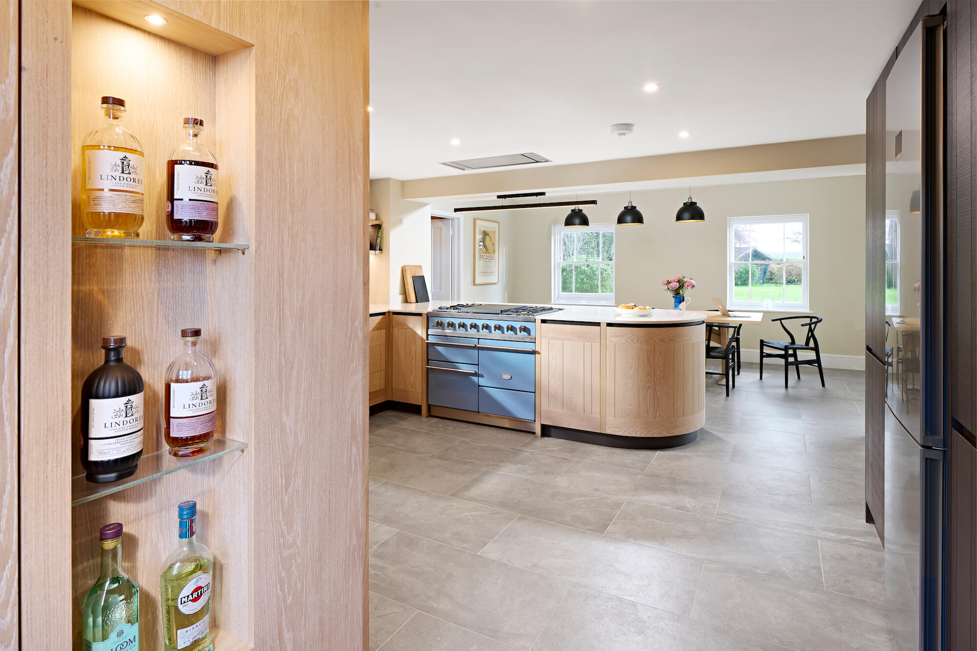
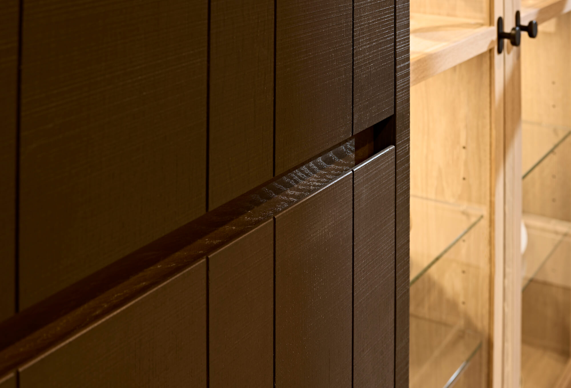
The kitchen is constructed entirely of oak but this has been sawn and treated in two different ways to provide texture and interest. Some is smooth-sawn and finished with a white wax-oil which gives a similar effect to lime-wash, bringing out oak’s beautiful grain texture and character whilst neutralising its tendency to yellow and contrasting with the alternative, rough-sawn oak with a charcoal-grey coloured finish. The smooth white oak provides the crisp contemporary feel while the rough, dark timber firmly roots the kitchen in its historic surroundings.
As cooking and entertaining is their main priority the clients were prepared to spend more on the Lacanche range cooker and Quooker boiling water tap while the fridges and dishwasher were pragmatically chosen from more modest brands. The neutral and blue paint colours on the walls and also on the Lacanche range were carefully selected by the clients to bring flashes of subtle colour, cleverly softening what might otherwise be a hard contrast between the two main oak finishes. More blues and complimentary colours also appear throughout the room in objects and artworks. It shouldn’t be overlooked how these objects that dress a space can be a final visual lift that really elevates a room visually but also makes it feel like a home. In this case, that’s really down to the clients keen eye.
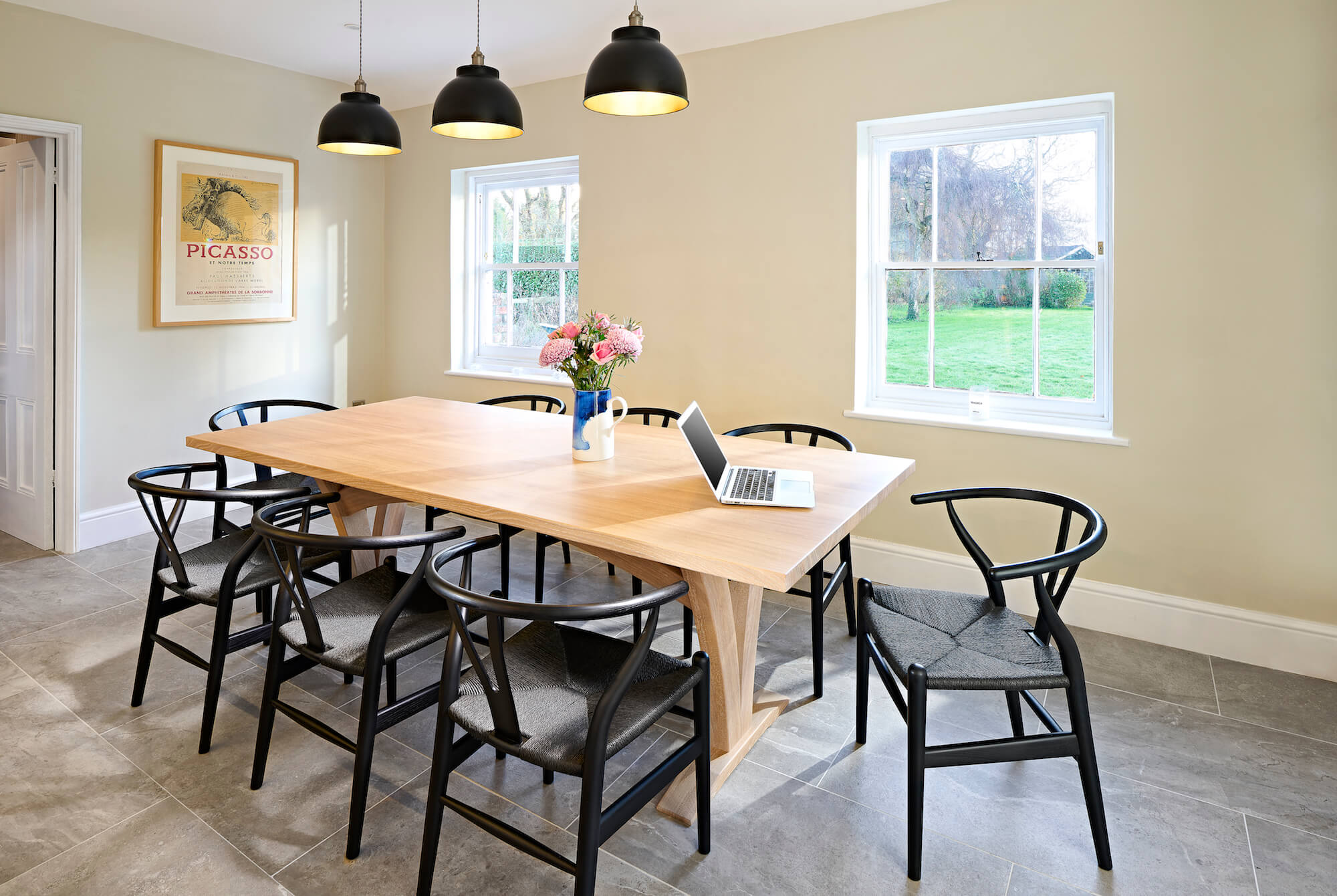
The levelling of the uneven floor presented the opportunity to install under-floor heating and also required completely new floor tiles to replace the old, uneven stone floor which was cold and difficult to keep clean. In this case, the client chose crisp, warm, ceramic tiles from Waxman which create a unifying pattern, colour and theme throughout the kitchen, dining and coatroom spaces.
The result is a user-friendly, modern kitchen, sensitive to the age of the property with a large, roomy and sociable feel. The formal dining area is separate whilst feeling part of the room and there is informal seating at the breakfast bar to ensure guests can chat to the cook while sharing a drink without getting in the way!
The beautiful solid oak dining table was designed by Simon to compliment the kitchen in an understated way, allowing the Hans Wegner ‘Wishbone’ style chairs in contrasting black to be the statement pieces at the end of the room. The opposite trick is played with the Pinch stools at the breakfast bar where they are framed by the black textured oak breakfast bar alcove. The light / dark oak contrast can be found all over the detailing of the cabinetry where light doors are framed by the darker details and textures.
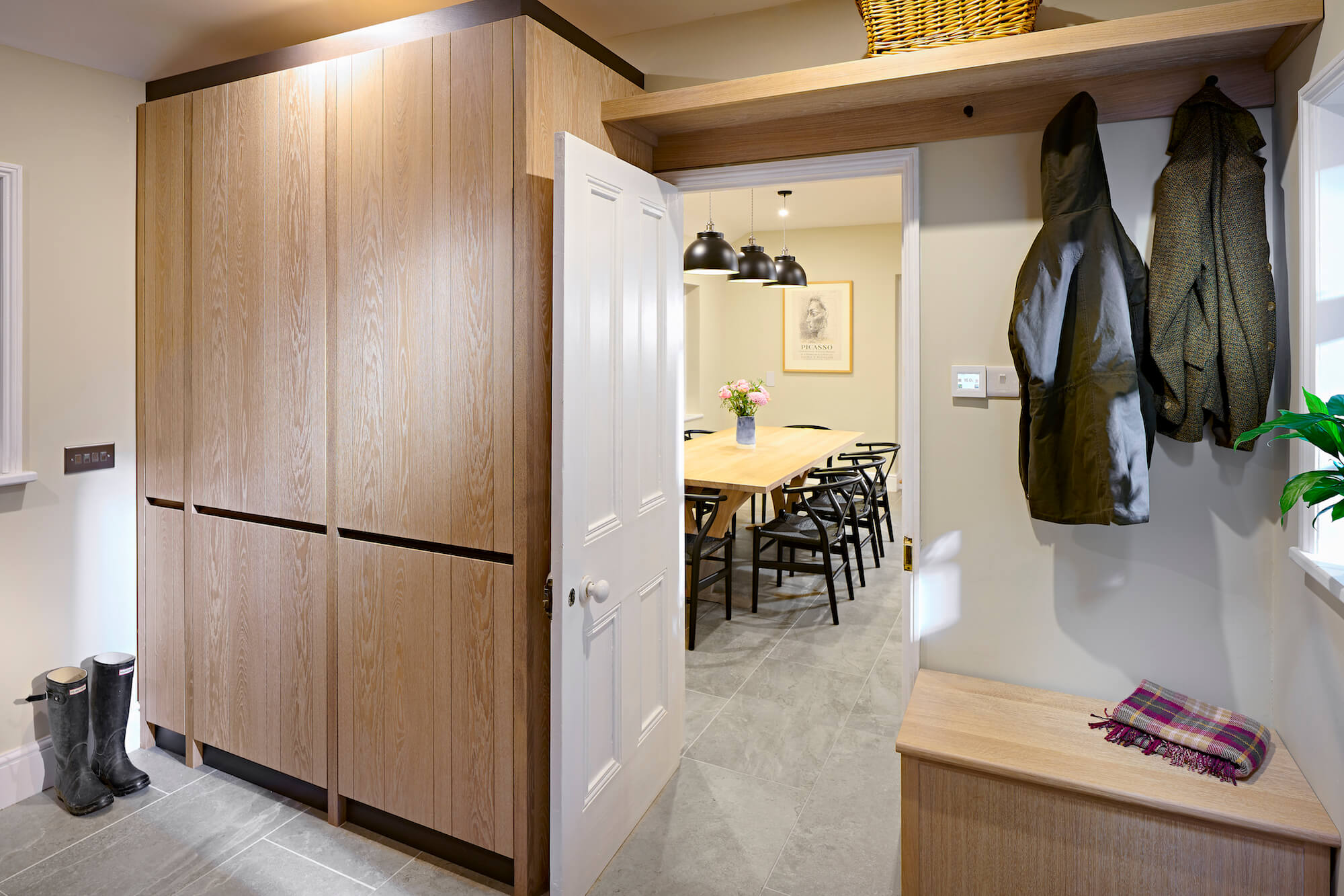
Just off the dining area of the kitchen was a rather chaotic utility room with a door to the outside which the client asked us to redesign for them at the same time. The laundry appliances and accessories were rehoused in floor to ceiling cupboards opening up the floorplan to allow for generous shoe and boot storage under benches with coat hooks and hanging rails above. All the cabinetry in here was made from the same oak as the kitchen but deliberately finished in a simpler form. Muddy boots and wet coats can now be removed before entering the kitchen whilst dirty gardening clothes can go straight into the washing machine.
It’s a kitchen full of delightful detail, dramatic materials contrasts, yet a subtle colour palette. A rural Georgian chic with a contemporary twist, but not a barely twist to be seen!
Perhaps the last word needs to go to the clients on this project and the overall experience of working with us…
“Our previous experience with many aspects of interior design is that the reality of the final result never quite lives up to the imagined design but in this case the reverse is true. We had high expectations and Simon and his team surpassed them. Even after six months of living with it, it still puts a smile on our face every time we’re in it.”
Mr & Mrs H
Appliances:
Fridge-Freezer: Bosch
Wine Fridge: Eurocave (used existing)
Range Cooker: Lacanche Macon Modern
Cooker Hood: Westin Stratus Flush
Tap: Quooker Nordic Twin Taps with Combi Tank
Kitchen Sinks: Axix Uno – The 1810 Company
Integrated Dishwasher: Bosch
Worksurfaces:
Kitchen: Silestone Snowy Ibiza 20mm
Cost (inc VAT):
Kitchen Cabinetry including peninsula, glazed dresser, larder and drinks cabinet surround in oak: £62,000
Dining table in solid oak: £5,750
Appliances: £11,000
Worksurfaces: Silestone Snowy Ibiza: £7,500
Chairs: Wegner Wishbone Style Chairs in Black Ash by Onske
Stools: Imo Bar Stool in oak by Pinch
Floor: Waxman Ceramics – Erding ‘Ash’ 90 x 45cm Tile
Photography:
Double Exposure Photographic
written by Bridget Pirie