Over recent years Simon Thomas Pirie have designed and made numerous pieces of bedroom furniture – with styles and material palettes as varied as our clients are. In this blog article Simon looks in detail at some of those projects and uses them to explore one of the key questions when clients think about bedroom furniture – namely should it be fitted or free-standing? Of course in reality many of our projects end up having free-standing and fitted work in the same space, pieces that are clearly related as part of a scheme but nonetheless have identity of their own.
I always think it’s important for a bedroom to feel like a haven, a tranquil but functional space. Somewhere you can be yourself and that you only share with your nearest and dearest. As a designer it always feels like the ultimate sign of trust to be asked to design a bedroom, so I always like to not ‘over design’ these very personal spaces.
Of course for most of us the bedroom also has to function as an important storage facility – primarily for clothing but also umpteen related functions like the management of the washing, space for reading books, the storage of the small personal items and of course a dressing and make-up space.
Nowadays we also have to consider charging phones and other devices and how much in the way of screens / TV’s we choose to allow into these spaces. Lighting is another key consideration, bedrooms have to function on so many different levels that getting the lighting correct is crucial and often overlooked, more so than in any other space I think.
Some of these schemes are collaborations with established interior design practices, these are often whole house projects that have included numerous bedrooms and sometimes dressing rooms connected to bedroom suites. On these larger projects there is usually more ‘fitted’ furniture and the spaces are conceived with walls of practical storage from the architectural stage onwards. They tend to be at the luxury end of the market so the rooms are generously proportioned.
On smaller individual bedroom projects we are usually refurbishing a room in an existing house so we have to take into account more existing architectural and design constraints. That can make it more challenging than the ‘clean sheet’ of a new build, but the flip side is they can often have more inherent character to start with.
Every bedroom project we get involved with is given the same attention to detail through the design process and manufactured by the very skilled team in our workshops. It is designed to suit the scale of the room and size of the budget. You will get a real sense of the breadth of our bedroom work through the following images:
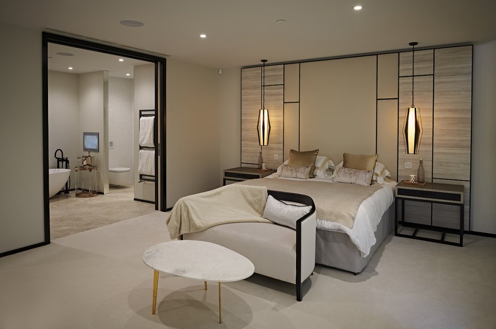
Our first foray is very much down the fitted theme. This was in partnership with our friends at WN Interiors and Westcoast Developments in a luxury Penthouse in Sandbanks, Poole. We did lots of the furniture in various rooms but let’s focus on the Master suite which comprises of the bedroom, dressing room and ensuite bathroom. WN consistently come up with lovely themes and textures that bring warmth to spaces.
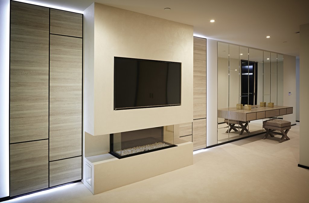
We also designed the finely detailed door architraves and very minimal skirtings. Combined with the repeating rectangle patterns in the headboard, backlit wall panels and mirrors, this tied the space together with a strong theme. The palette is quite monotone, there isn’t much colour and yet it feels rich and opulent both in the bright natural seaside light and when the mood changes at night.
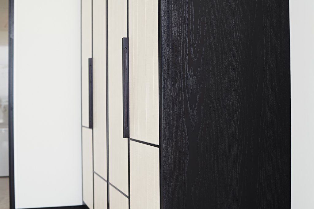
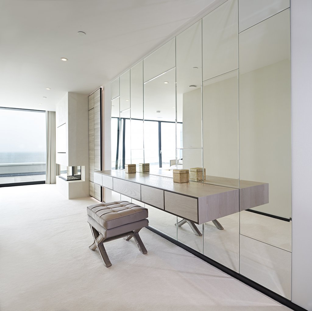 The panels have a paper product on which has a horizontally dominant but organic feeling texture. The darker timber frames – a very dark brown oak (almost black but not quite) is used in the bedroom only as the ‘outline’ to those repetative rectangles. It’s strong but subtle.
There is plenty of mirror glass to bounce light around the space, this works particularly well around the floating dressing table which really opens up what would otherwise be a rather unloved corridor between the main bedroom and dressing room.
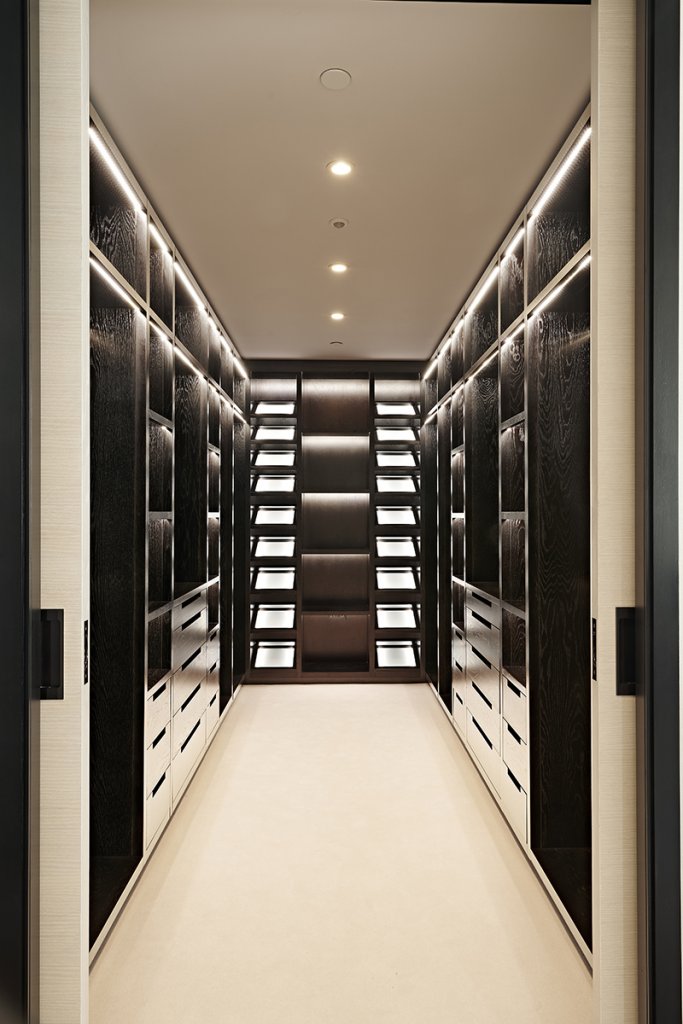 The dressing room itself is finished in the darker oak timber – used sparingly in the bedroom space it is dominant here, the contrast being with the gold hardware. There is lots of clothes and shoe storage behind the sliding entrance door. I particularly like those under-lit shoe and bag shelves at the back which draw you in. As well as the opulence it’s all about making the maximum use of space in an apartment like this where storage is always at a premium. It also means the bedroom does not require significant wardrobe storage allowing the space to be lighter and more open as a result.
Elseware in the property we also created fitted wardrobes in 3 other bedrooms, while all were similar in format each one had it’s own distinctive character and material palette. Perhaps the most striking one being with textured plaster panels from Armourcoat. This used the same geometric rectangular frame detailing as in the master suite.
It’s probably worth saying the Ace Penthouse in Poole was designed speculatively, as a luxury space to appeal to sell to a broad audience and probably as a second home. That’s very different to our next bedroom.
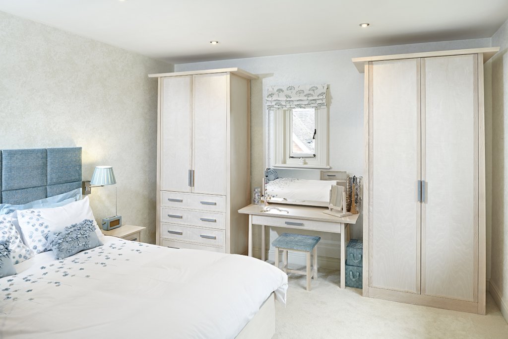
This is the master bedroom of long standing clients that we have worked for consistently for on and off for 2 decades. We understand their personalities and taste well. The renovation and redecoration project was one room in a elegantly proportioned Edwardian House. The room is relatively small by modern standards though and designs were somewhat constrained by window and door openings on all 4 walls.
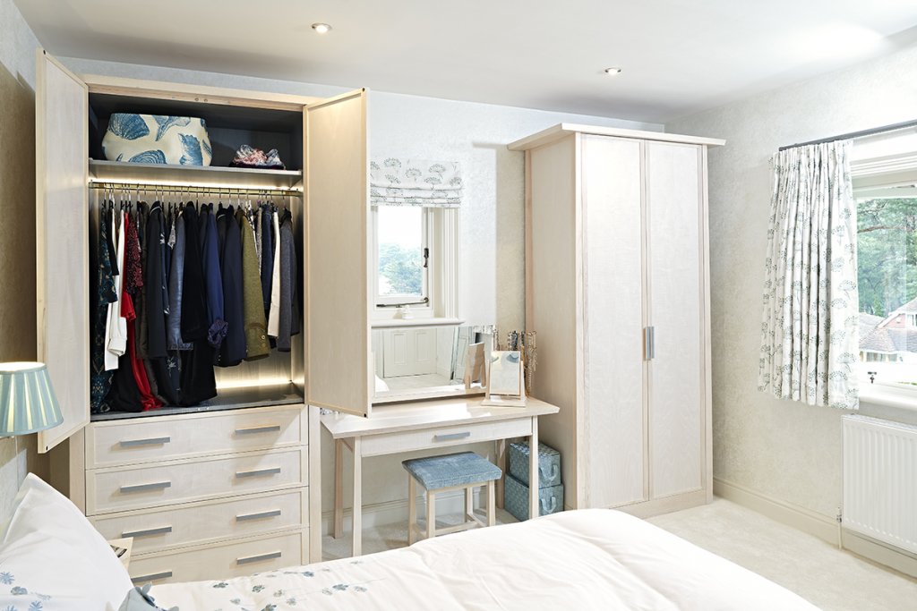
Given those limitations it may be a surprise that we opted for freestanding pieces as they don’t necessarily ‘maximise’ the use of space. What it does offer though is the retention of the proportions of a room by being able to see the original corners, skirtings and walls. We are also forced to work with features like the small window between the wardrobes which we had to turn to our advantage and use as the space for a designing table with perfect natural light. In many ways that’s a far more challenging design brief than a wall of floor to ceiling fitting storage furniture.
The scheme included wardrobes, bedside tables, chests of drawers, a dressing table, the bed-frame and headboard for the space. After a long run of very fitted projects it was genuinely refreshing to make a room full of free-standing furniture again. It becomes an exercise in the proportions and relationship between the individual pieces and their relationship to the space. There is a lot going on in this relatively small room. I should say there is also a dressing room so most of ‘his’ clothes reside in there. The storage is therefore really for ‘her’ clothes – but that’s the way it had evolved already and they were comfortable with that.
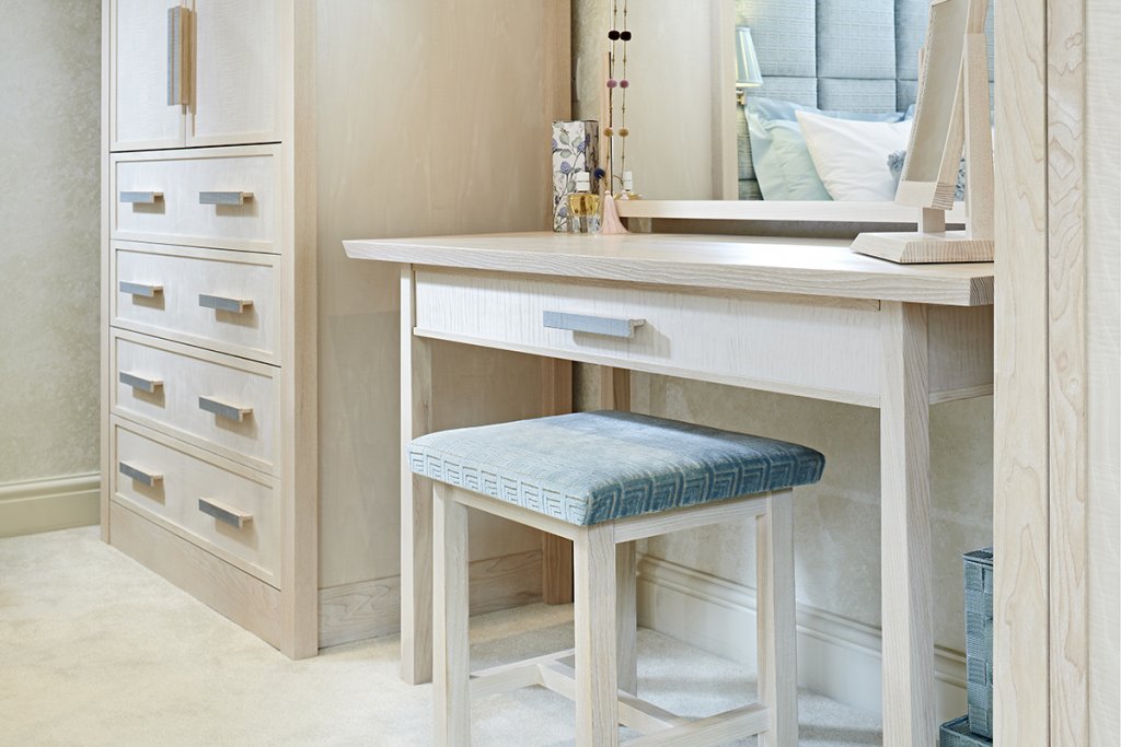
I love this room and the soft material palette of white-washed ash, pearl coloured figured sycamore and the lovely teal blue figure sycamore detailing on the handles and furniture interiors. The wardrobes are lit on the inside so at night particularly the colour really sings when the doors are opened. The fabrics were chosen by the clients and continue the teal blues to greens. It was an antidote to the white / grey / black palettes that have been so prevalent for the past 5 years or so.
The form and proportion of the furniture was also influenced by the Edwardian period and the architecture itself. I think it also has a very English feel and it’s no accident that there is quite a nod to Ron Carter’s work here. Ron has always been a big influence on me and you can read about his very English contemporary design here in a blog story from a couple of years ago.
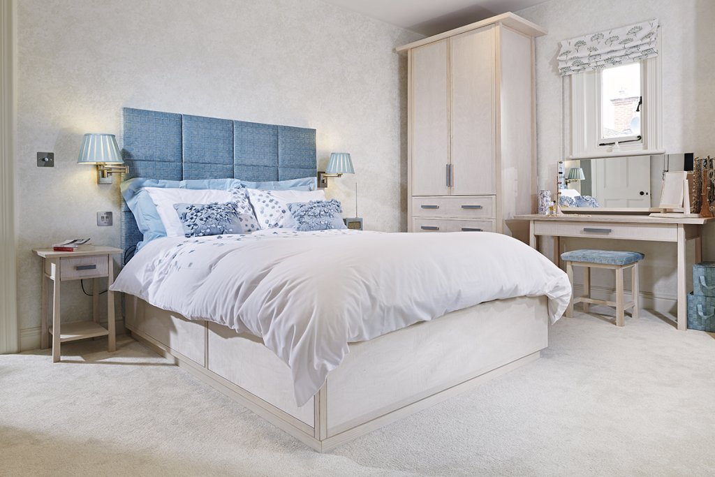
So because of the familiarity with these clients, the informal feel they wanted in the room, the size and proportions of the space and the desire to be sensitive to the architecture and period, free standing furniture was very much the right way to go in this bedroom.
Of course there is furniture which falls in-between what might be considered ‘fitted’ and ‘free-standing’. That’s something we have done a lot of as well, it very much falls into the realm of bespoke makers like us as it’s not something you can buy ‘off the shelf’…
Another large project for us from a few years ago. Once again we were doing multiple rooms but with particular focus on the bedrooms. We were working with Barcelona based interior designers Lazaro Rosa Violan who produce very exciting interiors for hotels and restaurants as well as some residential projects which exude a very Southern European feel.
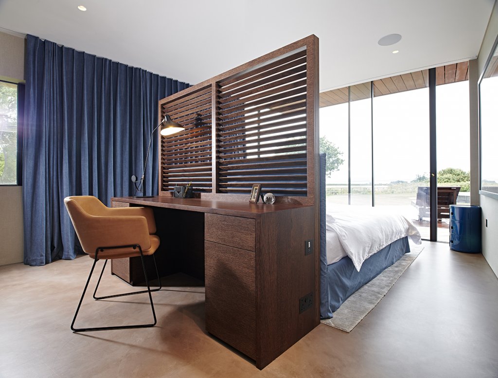
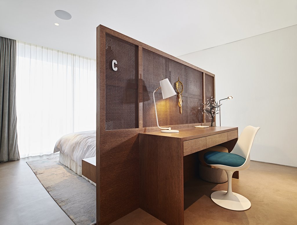
Where that line between free standing and fitted bedroom furniture became most blurred was on the double-sided bedheads which had the bedhead and bedside tables to the front and desks / dressing tables on the reverse.
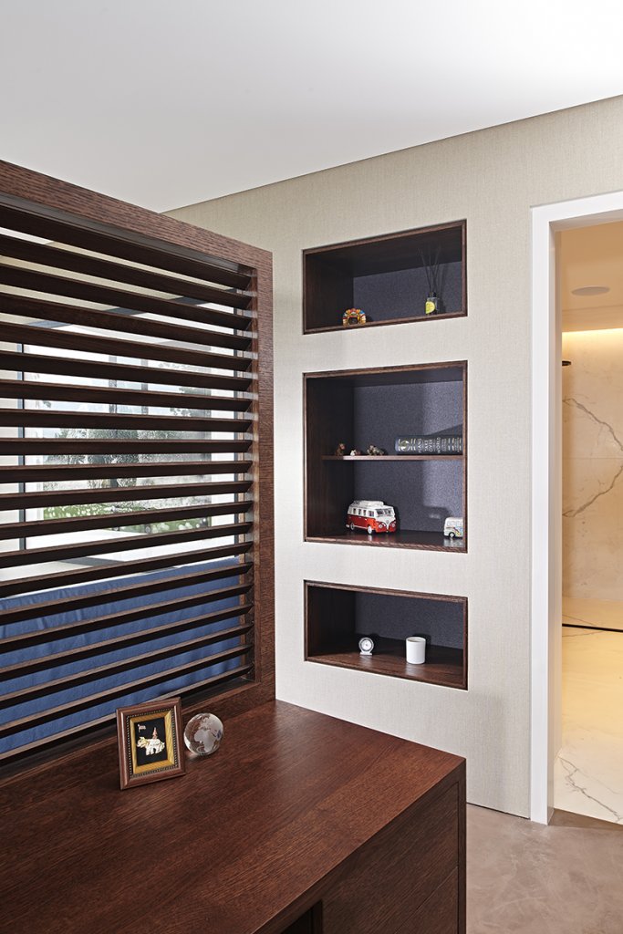 Although none of the bedrooms were enormous this did make really good use of the space – helped by the fact the bedheads were not solid but made from panels you could partially see though – woven cane or angled timber slats. The rooms had wardrobes fitted into the back walls and open storage alcoves in the walls next to the beds. As is often the case in contemporary houses one whole wall was glass, with not a bad view of the Isle of Wight from the beds.
We also tackled the master bedroom wardrobes and free-standing (but fixed due to complex wiring for the lighting and automated home technology) curved bedside tables. Again we were responding to the interior design teams ideas and the architecture which in this space has a complex curved roof structure with a strip of high windows at the back and a full wall of curved glass to the front.
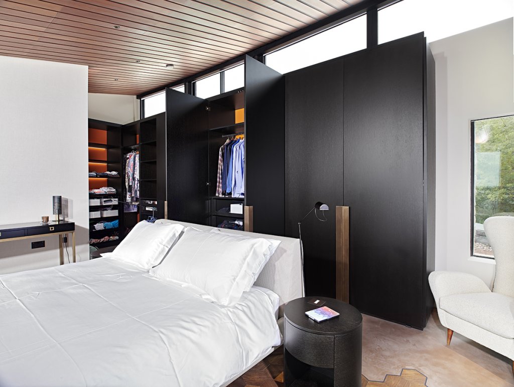
This was another challenging space to work with, but the outcome was pretty spectacular: A run of 2.8m high wardrobes, open shelves and drawers in dark oak and bronze fitted into the complex geometry of the room. All the unit interiors had vibrant orange leather back panels which were washed with warm LED light.
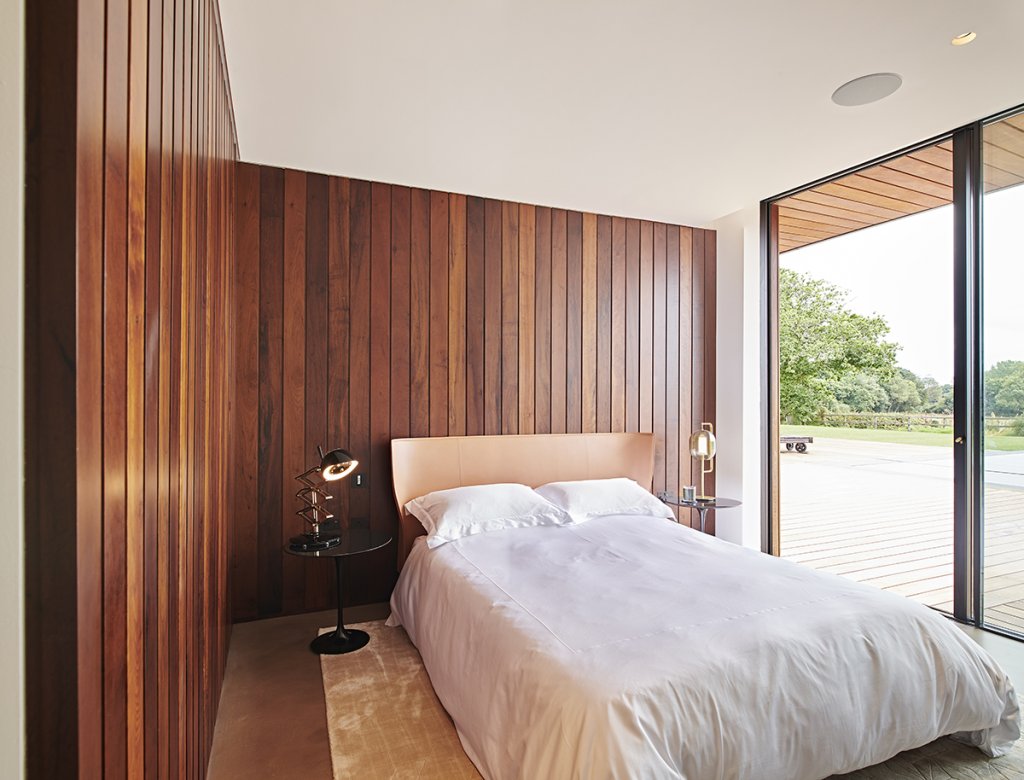
We also worked in the guest bedrooms on various headboards and even full panelled walls which was particularly successful. This created very warm and inviting spaces with very little furniture in it. Panelled and slatted walls are another design feature worth considering that we have become particularly good at. You can learn more about wall panelling in interior projects we have worked on here.
These rooms look simple but they were anything but. In fact the architecture stretched everyone from building contractors to interiors team. The outcome was certainly worth it though.
Not every bedroom we’ve been involved with has stunning panoramic views of the Coastline through a glass wall, but this one does have rather a good view of Old Harry Rocks in Dorset! This was another project with WN Interiors that very much picked up on that seaside vibe – slightly driftwoody / natural materials / beach chic / muted relaxed colours… We did a number of elements in this house including furniture for the dining room, living room and master bedroom.
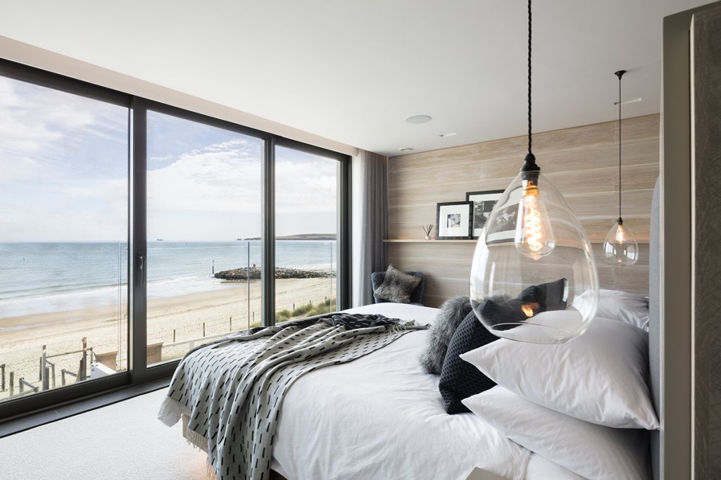
Like on the previous project the bedhead became an island with an upholstered headboard and floating drawers to the front and a dressing table and mirror on the reverse face. This really works well at keeping the room feeling airy, allowing natural light to the back of the space where there were his and hers dressing spaces. It also hides all the clutter at the back of the space ‘zoning’ the dressing and sleeping areas.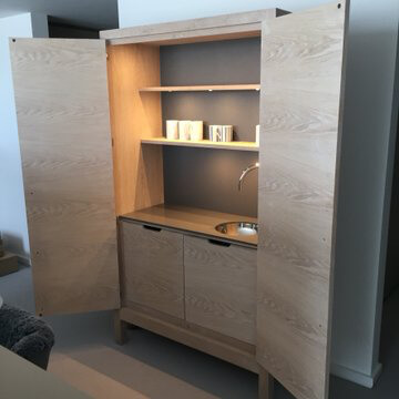 Between the two dressing space openings is a free standing drinks cupboard for making tea and coffee. That may sound a little hotel like, but just imagine a Sunday morning lie-in looking at the view where you don’t need to go to the kitchen to make a morning cuppa – bliss! The cabinet is up on legs with a gap below to emphasise it’s ‘furniture’ credentials even more. It has a Quooker boiling water tap within and plenty of storage for cups and everything else drinks related. I really loved this piece, for me it made the room, making the space feel more relaxed – it felt less ‘designed’ as a room because of it.
The washed whitened oak finish throughout the room used different textures and cuts of oak including end grain as a detail in places. One wall was panelled by us in washed white oak boards laid horizontally. That picked up on the big horizon and seascape out of the window. At chest height there is a single narrow backlit shelf for family photographs and artworks. This again adds to that very informal feel – a cocoon of warmth.
Further images and case study of this project…
I have one final image I want to share which takes that informality to it’s logical conclusion and really led me to write this ‘designers notebook’ story about fitted vs freestanding furniture in the bedroom.
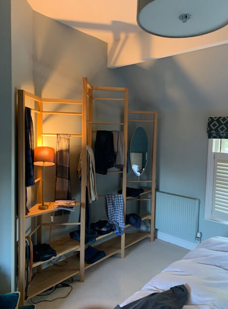
Recently I had a call from a new client who was looking for something different for his bedroom. He explained that he liked to hang and drape things around his room, that he wasn’t obsessive about putting things away and tidying up. He liked a bit of ordered chaos and wanted something designed to reflect that. It also had to work with an awkward angled space around a chimney breast in his Hampshire cottage. He already had lots of nice furniture and objects around and thought we may be the designers that could help him out. Always up for a challenge we designed and made an angular clothes hanging rack, with shelves, an oval mirror and a long-low shelf that doubles up as a perch seat.
It’s a long way from the Sandbanks dressing room but goes to show that perhaps in the bedroom space more than any other it’s your own character that needs to be reflected back. You just have to find the right designers to help you do that, and you’re there already!
Written by Simon