
Those who are familiar with Bournemouth will recognise the iconic Bristol and West House which stands on Richmond Hill overlooking The Square in the centre of town. The former building society head office has recently been converted into 38 luxury apartments whilst the developer reserved the rights to build a penthouse on the roof for himself. We were delighted to be approached by WN Interiors to work with them and their client on the design and manufacture of the kitchen for this unique property.
 The building itself dates from the 1950s and is, in essence, modernist in design with many of the original features still evident both outside and in the foyer. Whilst the penthouse was a new build on the roof, the client wanted to reflect the building’s original design in its interior and gathered a strong design team from Brightspace Architects, WN Interiors and ourselves to draw together a collection of concepts, themes and design detail they wished to incorporate. The ongoing conversation between WN Interiors and ourselves centred on achieving the desired aesthetic throughout the apartment through colour palette, textures and mood.
We have worked with WN Interiors on a number of projects before and so we already had a very good understanding of the way they think and what they are trying to achieve with their designs. Their cool, neutral, modern design style is complimentary to ours and we like the fact that when we collaborate with them we are challenged into thinking differently and trying new creative ideas.
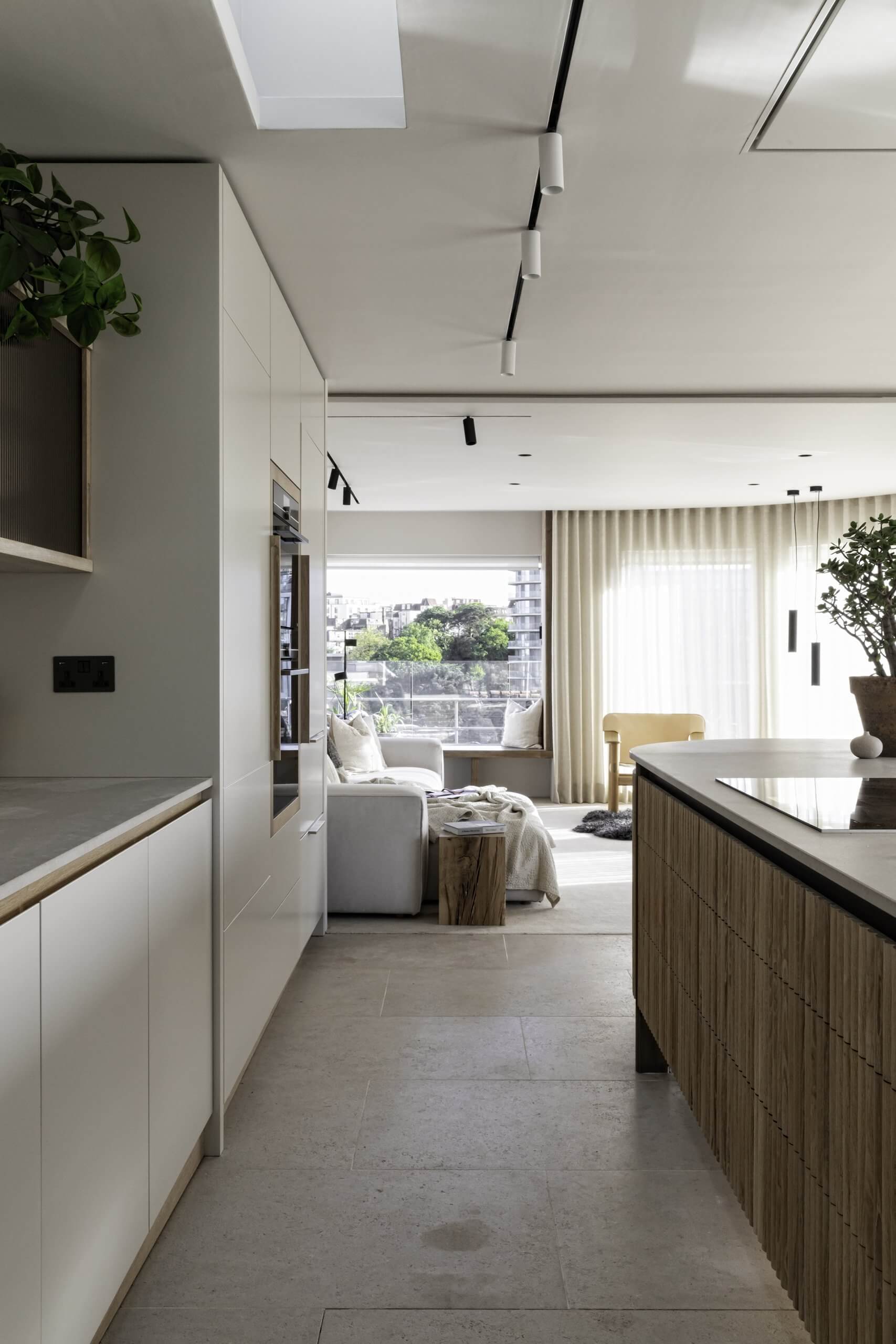
A combination of this established collaborative relationship and the quality of the design brief we had developed alongside the client meant that our first drawings of the new kitchen were almost exactly what was required. There were, of course, discussions had and changes made to the details but the principle of what they were aiming for had been very quickly established and this allowed us to move on to agreeing the materials palette. Careful consideration had to be given to choosing materials that would complement the other elements of the large, open-plan living space as the kitchen was to sit central to the room with a dining area at one end and the sitting room at the other.
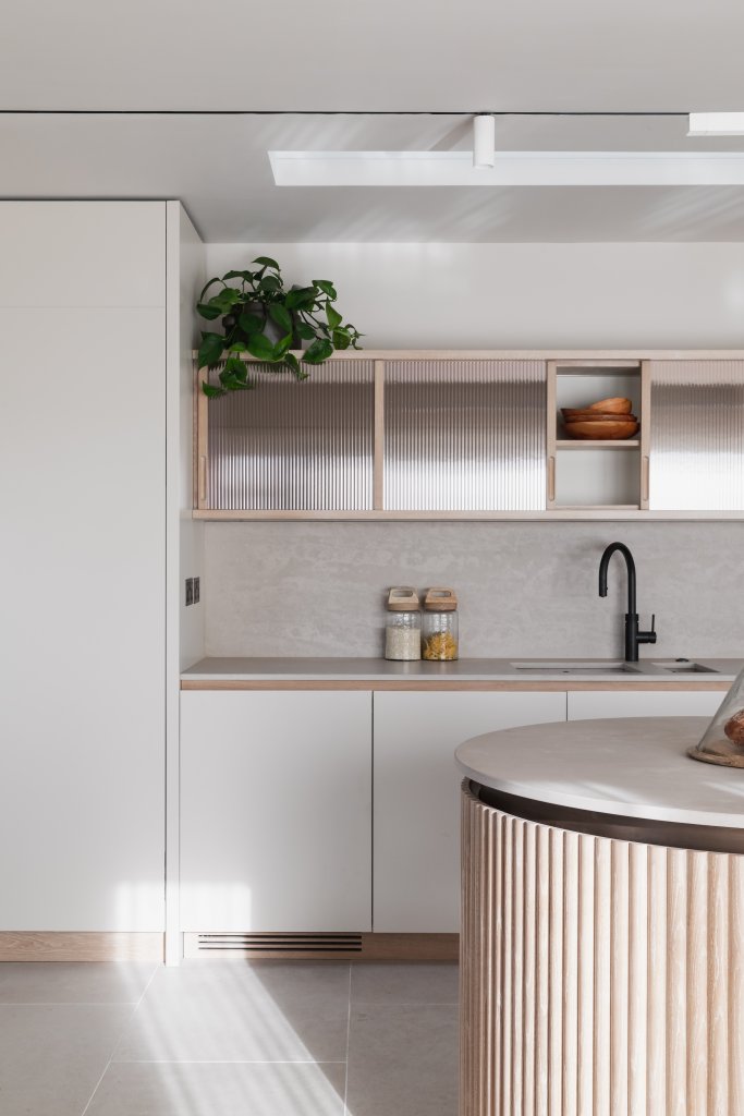
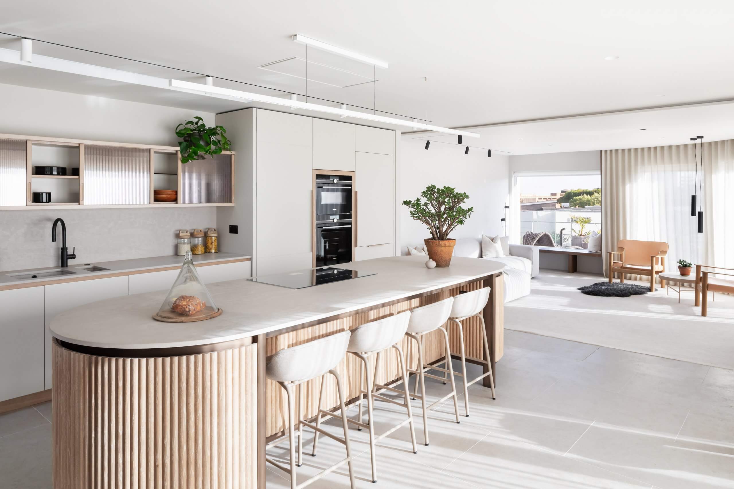
The long run of cabinets along the back wall were spray lacquered to match Farrow and Ball’s ‘Skimming Stone’ paint colour and these were highlighted with timber frames around some features. Washed-white oak was chosen as it exudes a warmth but provides the neutral tones required, mitigating oak’s natural yellow tints. The same timber was also used for the fluted elements on the island where it is the main material but this time contrasted with brushed bronze frames. Inside the feature cabinets and alcoves, a darker silver-fumed oak was used. This much richer, grey/brown colour provides a bit of drama working beautifully with the lighting in the drinks alcove and inside the cupboards. Calm, neutral tones were continued in the use of Caesarstone “Topas Concrete” quartz for the worktop, sink and splashback.
This kitchen is comprised of two main features: The 7m long run of cabinets along the back wall and the 3.4m long island. The cabinets to the left of the back wall contain a triple fronted drinks cabinet unit with shelves and drawers for storing non-refrigerated drinks bottles and glasses. The doors provide further bottle storage on 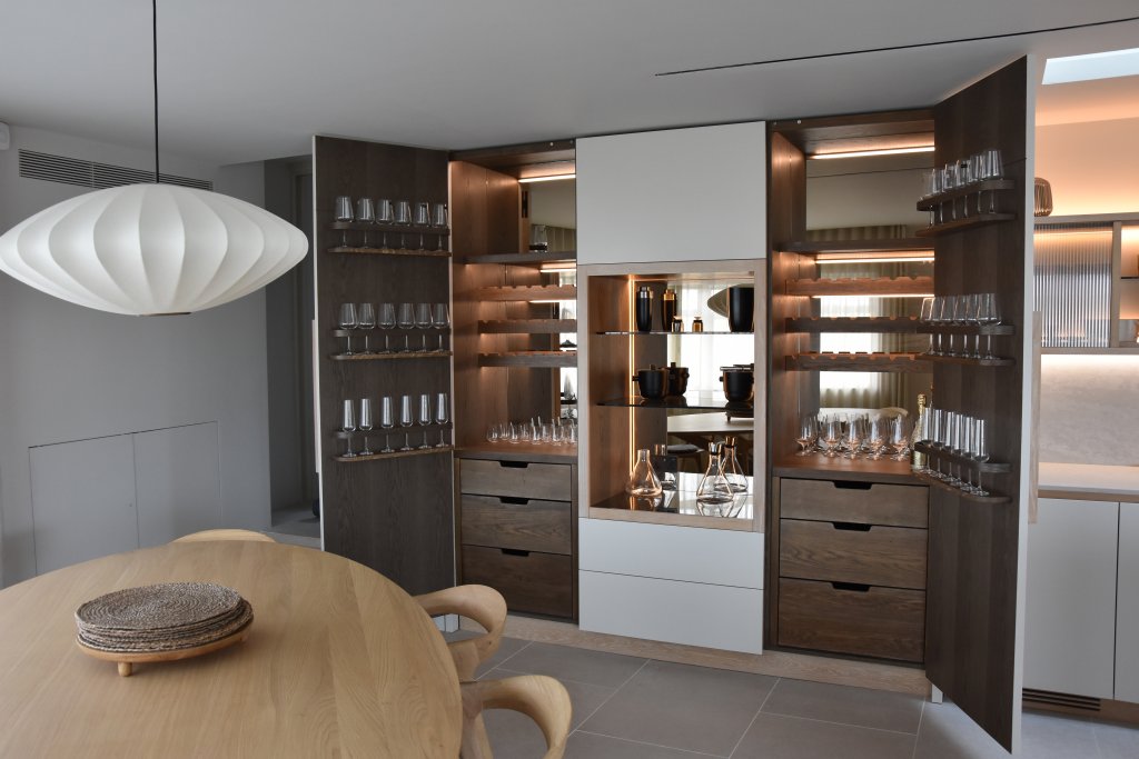 the inside and when both opened out create a sense of a walk-in wine cellar. The cabinets contain smoked glass mirrored back panels and are internally lit with LEDs on a sensor which brings them on when the door is opened. In the centre is an open alcove with smoked glass shelves and another mirrored back panel backlit with subtle warm LED lighting strips to add a sense of drama to the pared back minimalism of the rest of the unit. Above the alcove further storage is accessed via push-to-open, up and over doors.
In the centre of the back wall is the sink run. The gunmetal grey Axix Uno sinks from The 1810 Company incorporates side panels of the same quartz as the worktops combining the versatility of stainless with the beauty and elegance of the Caesarstone. The black Quooker Flex tap provides hot, cold and boiling water. The under counter units contain a Caple wine fridge, unusual in being integrated and not glass-fronted like most. There are then a couple of under-sink cupboards, an integrated Siemens dishwasher and pull out bins.
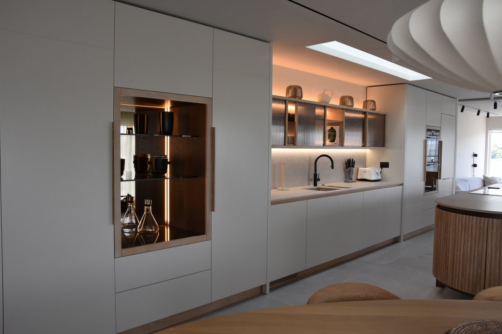
Above the sink is a narrow ribbon of glazed wall cabinets divided into 5 sections but made as one single 3m long unit. It has 4 sliding, fluted-glass panels which allow the client to choose which element to leave open for display. The fluting of the glass is echoed in the timber of the island. But more of that later…
The shelves in this unit house yet more lighting, both above and below and also internally at top and bottom. This provides a cosy wash of ambient light whilst also highlighting the contents of the cabinets and transforming the fluted glazed doors into shimmering lanterns at night.
To the right hand side of the sink unit, more cabinets echo the drinks storage on the left but this time house a large larder cupboard, central double oven stack of Siemens standard oven and combi/microwave oven, and finally a large integrated Liebherr fridge with freezer drawers beneath. Once again, storage is maximised by the use of push to open doors above and deep pan drawers beneath the ovens.
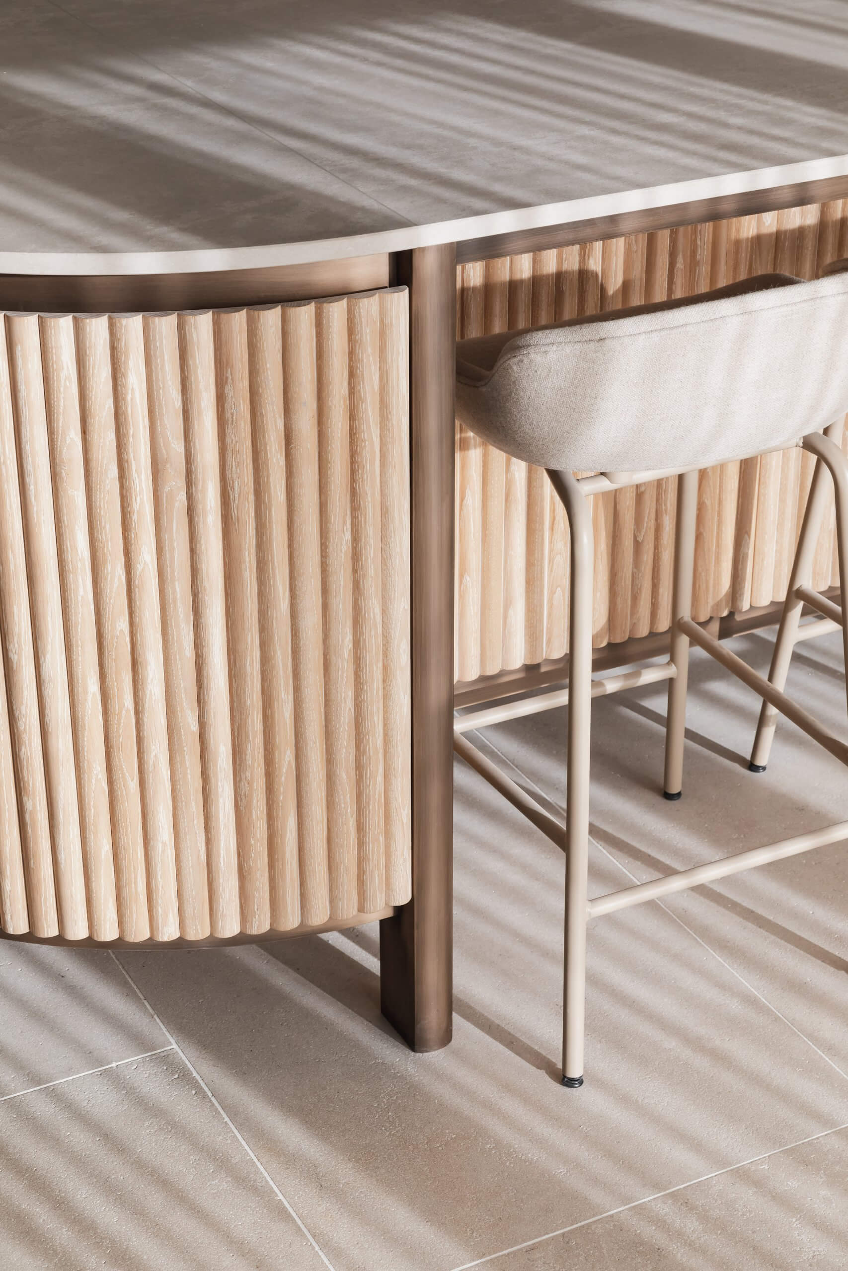
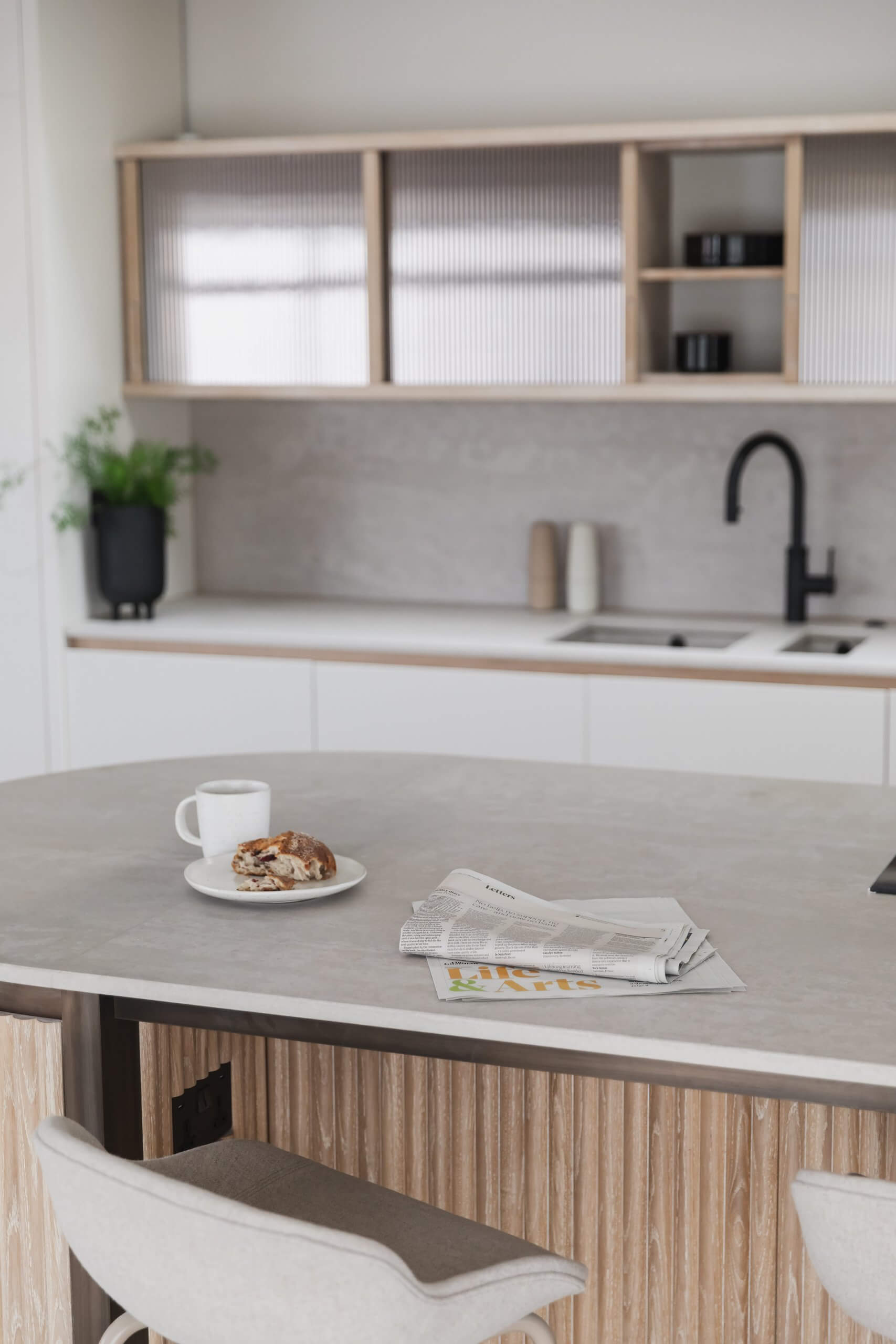
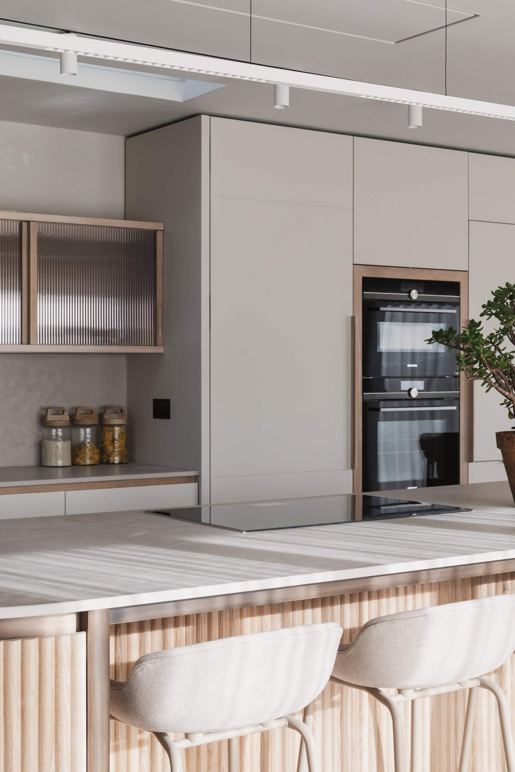
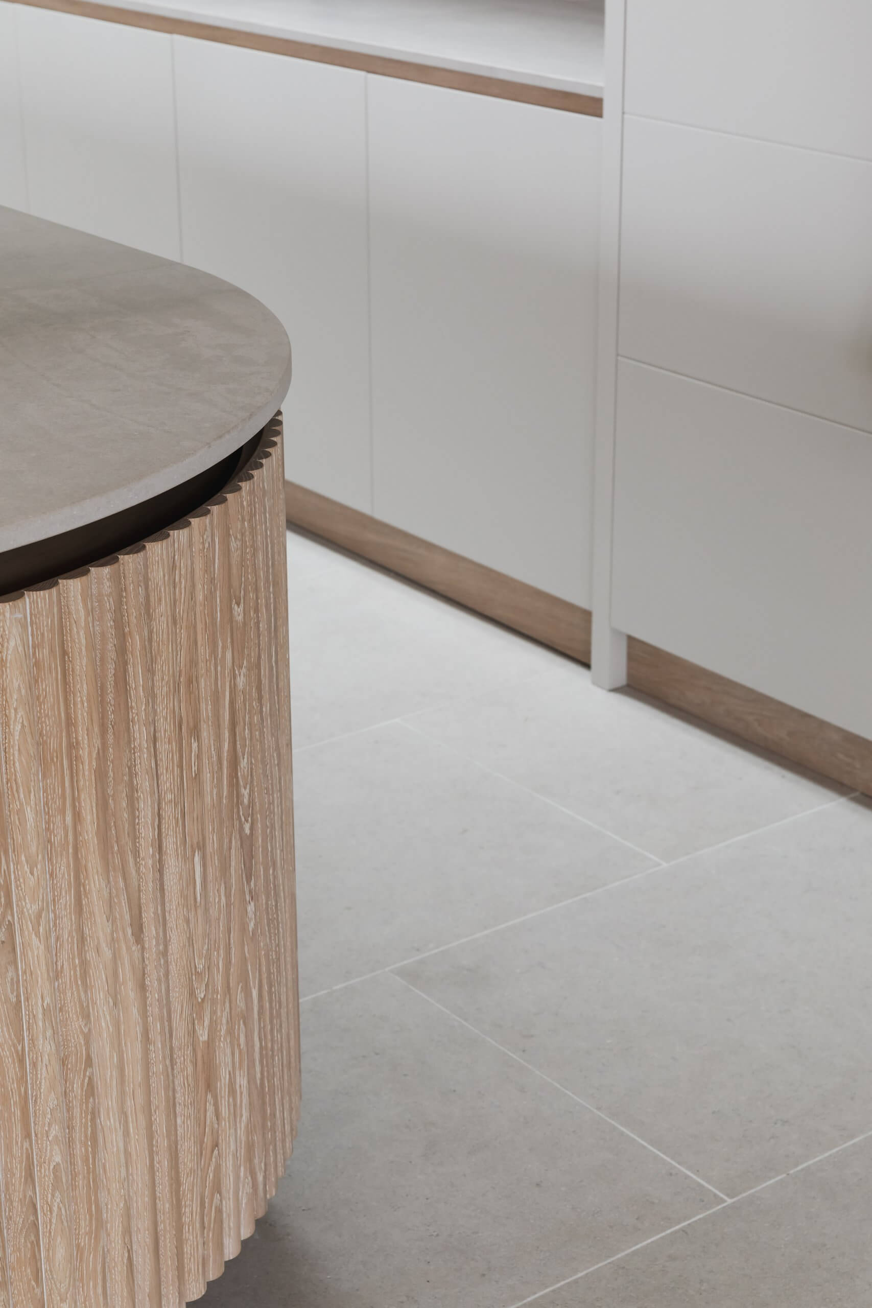
The substantial island is designed to appear as a piece of furniture, and were it not for its size, could be described as looking like a sideboard. The side facing the sink contains all the remaining functionality of the kitchen. A Siemens induction hob is central with 9 drawers beneath, a row of shallow drawers at the top with dividers for cutlery and utensils, and deep crockery and pan drawers beneath, complete with peg spacers to hold stacks of plates secure. At either end of the island are D-shaped cabinets, perfect for large serving dishes and tureens and other bulky kitchen items. The fluted curved doors were technically very difficult to make but fortunately our senior maker, Mike, loves a challenge and he put his skill and experience to work to construct these stunning and completely unique doors.
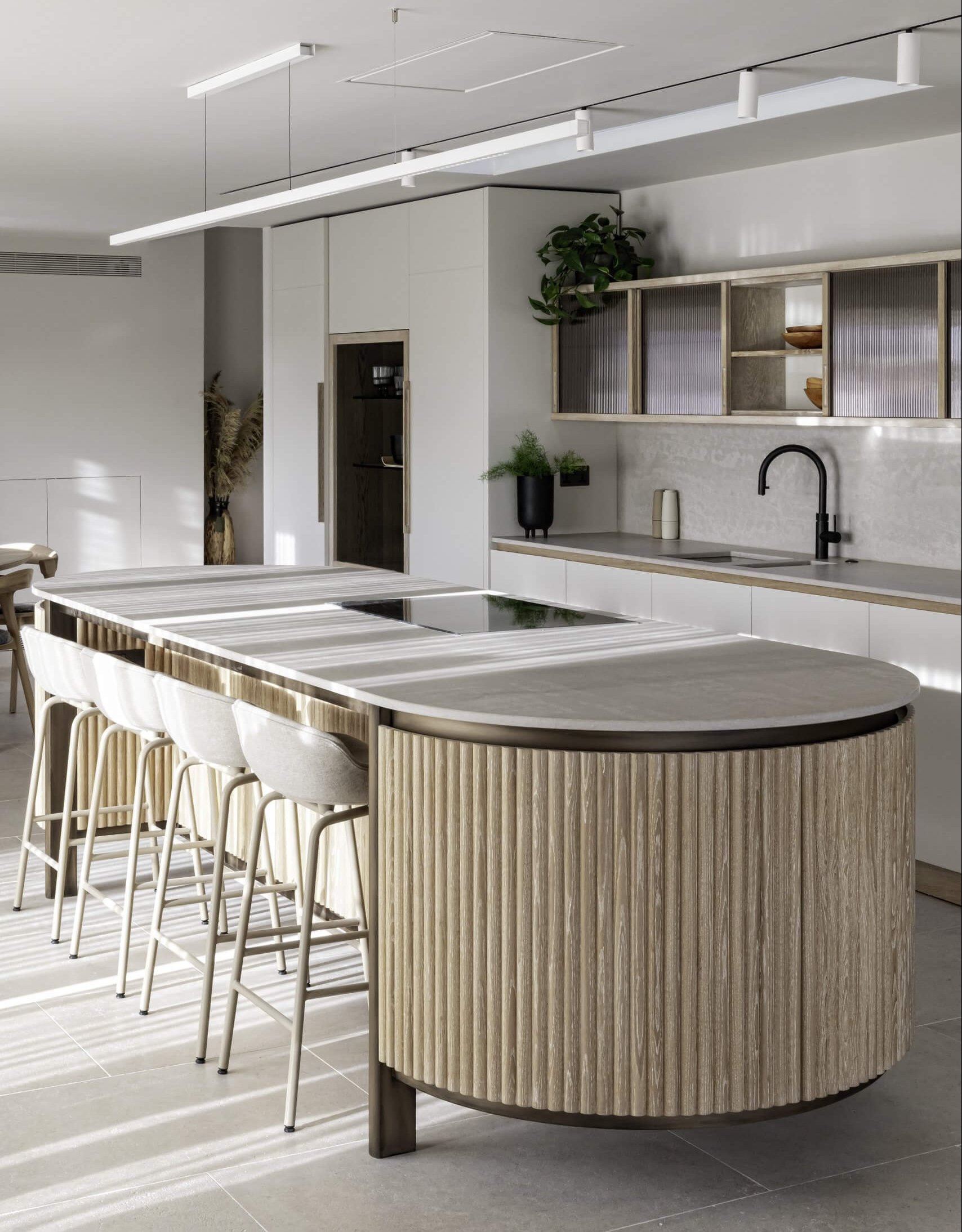 The other side of the island is a generous alcove creating a very sociable breakfast bar seating four and is complete with discreet sockets for charging the all-important laptops and devices. The illusion of a standalone piece of furniture is created by standing the island on legs, finished in brushed bronze to appear like metal. These legs, not only support the weight of the island but also contain a conduit for the electricity supply to the hob and power sockets so there are no unsightly trailing wires or ducting. Behind the delicately fluted exterior, the carcase of the island is carefully engineered so as to provide its own structural support and stability. Above the hob, a Westin Stratus Air extractor hood sits flush to the ceiling and is painted to match.
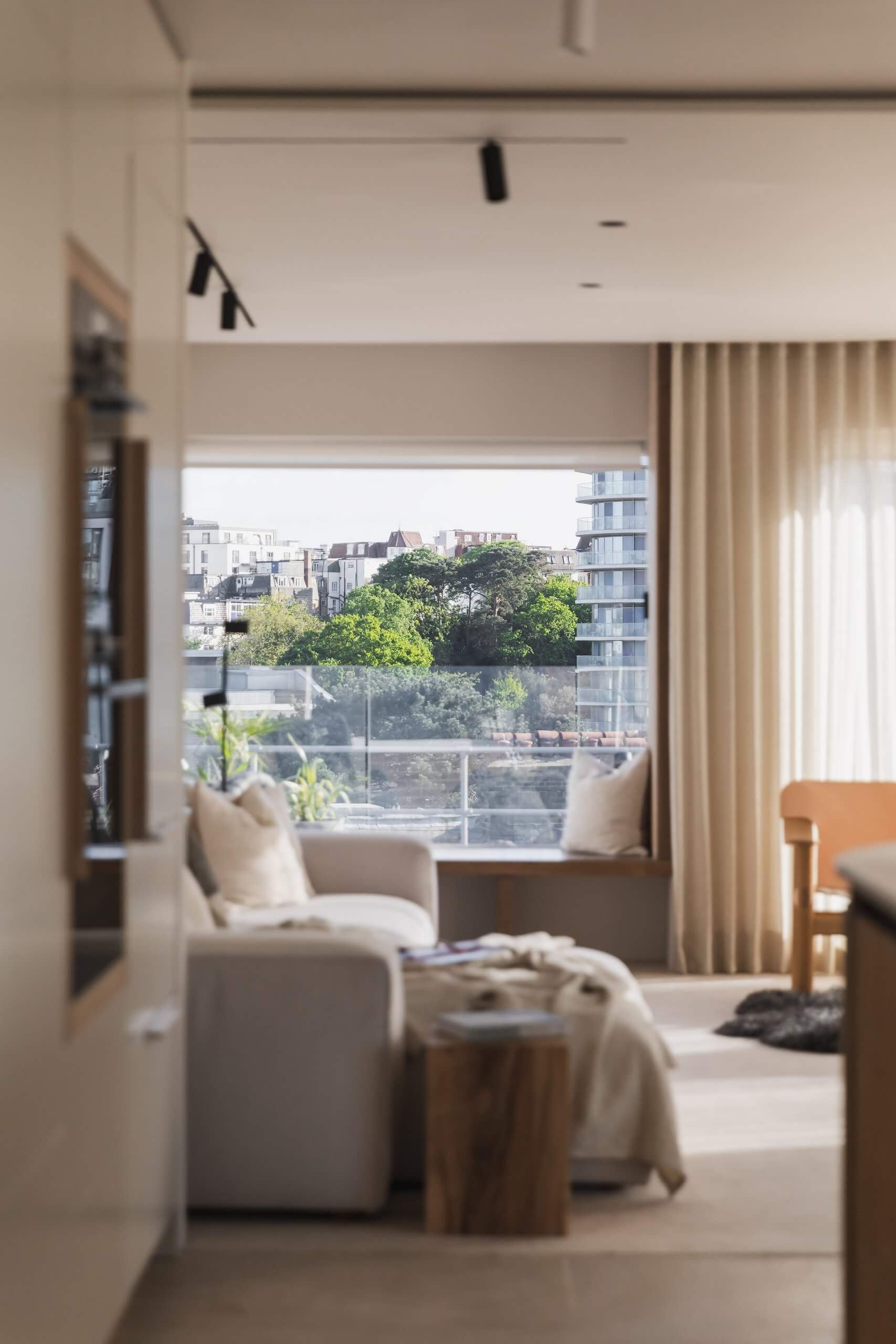
The final contribution we made to the overall design of the whole open-plan space was the creation of a seat in the picture window at the sitting room end. This not only brought together the kitchen and living areas of the room through the use of the silver-fumed oak for the seat and the washed-white oak for a fluted panel to the side, but also enhances the connection between the inside and the outside, framing the view and giving a sense of sitting on the roof terrace even when the weather is less obliging. The fluted side panel also houses a sleek, pull-out reading light which turns the window seat into a cosy reading corner as the light outside fades and the sea view transforms.
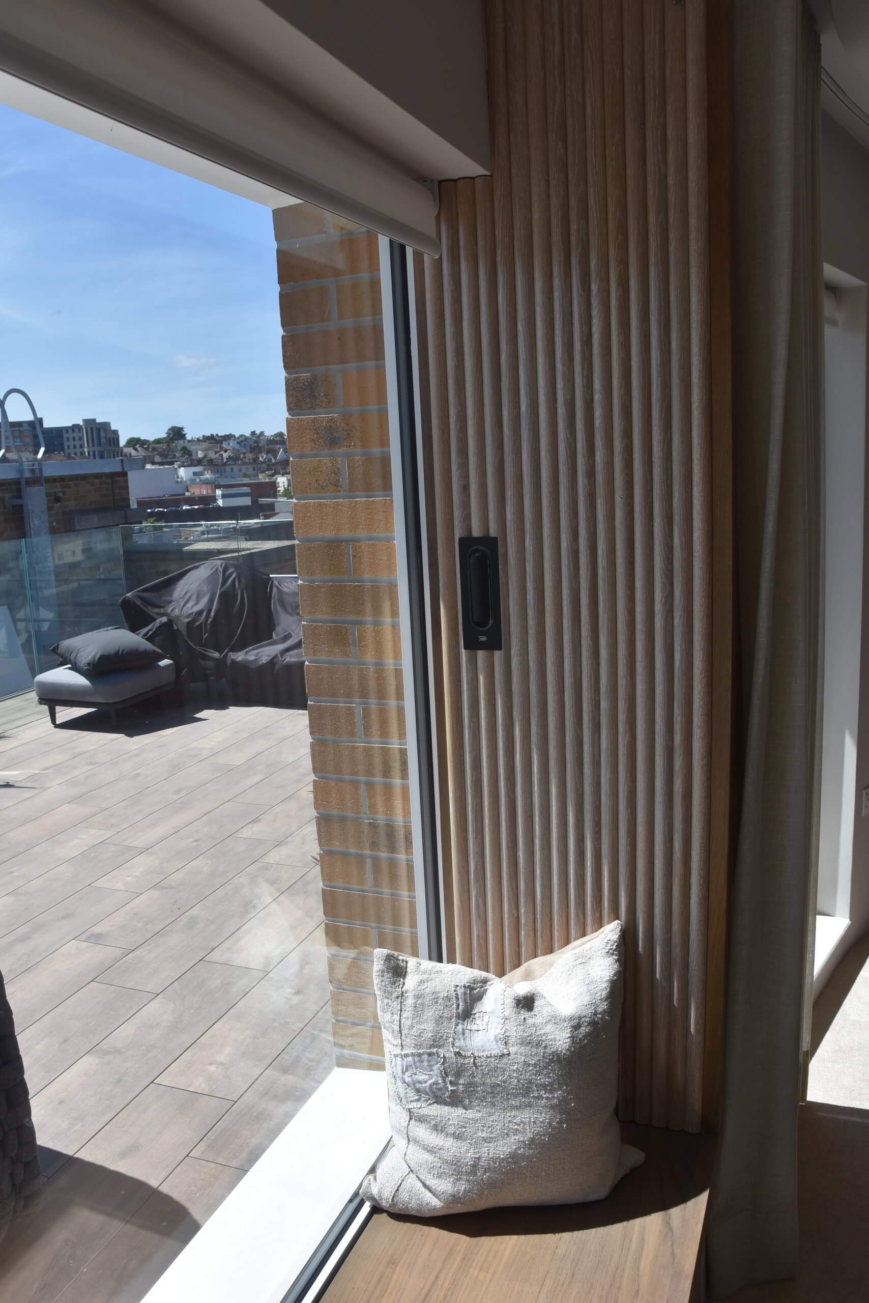
Whilst the design and manufacture of this kitchen was relatively straightforward, notwithstanding floating islands and fluted curved doors, there were some very unusual circumstances to contend with. The first of these was the small matter of a global pandemic which struck early in the construction phase and consequently drastically delayed the delivery and construction of the penthouse itself. Our workshop managed to continue to operate after a short closure at the start of lockdown but of course that meant that we had an entire, complete kitchen, ready to fit and having to store while the construction work caught up. Another complication caused by a combination of pandemic, Brexit and a ship getting stuck in the Suez, was (and still is) the erratic supply of kitchen appliances some of which turn up within days of ordering and others taking months to be delivered.
Add to this the small matter of the penthouse being five storeys up (or seven, depending on which end of the building you’re counting from – it being on a hill!) The completion of the luxury apartments meant that is was not possible for us to use either the newly decorated stairs or the refurbished lift (which was too small anyway) and frankly none of us much relished the idea of hauling all the cabinets, appliances and stone up all those stairs. Fortunately, 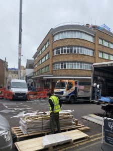 we were granted permission to make use of the crane which had been hired by the builders to lift the stone for the roof terrace and some of the huge glazing panels for the penthouse. However, this did mean we had to bear the disgruntlement of many Christmas shoppers as we closed one of the main access roads to the town centre in the second week of December! And had to carefully wrap and protect it all from damage from other trades and the weather until the glazing was fully installed and the property properly weather tight.
Of course, the most important measure of success is a happy client so we were delighted to receive this review from the owner:
“Simon and his artisan team worked hard to provide the penthouse not just with a functional kitchen but an outstanding piece of furniture that is a pleasure to enjoy every time you walk into the room.
From beginning to end Simon Thomas Pirie was a pleasure to deal with, straightforward and I would not hesitate to recommend their craftsmanship.”
Despite the challenges, and maybe in part because of them, we are extremely proud of this kitchen and of the creative and dynamic professional relationship we have developed with WN Interiors with whom will be working again soon.
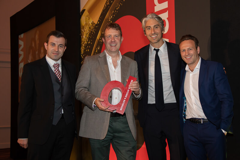
BREAKING NEWS – Our stunning Bristol & West kitchen has been shortlisted for the Designerati ‘Kitchen of the Year’ (Over £40K) Award. We last won this prestigious industry ‘Big d’ award back in 2018 for our Bliss kitchen on the Norfolk Coast so watch this space..!
To read about some of our other collaborations with WN Interiors, please visit:
Sandbanks Penthouse Apartment
Chic Harbour Side Home
Appliances:
Ovens, Dishwasher, and Hob: Siemens IQ700 Studioline range
Fridge Freezer: Liebherr 76cm integrated
Wine Fridge: Caple under counter integrated
Extraction: Westin Stratus Air
Sink: 1810 Sink Company – Axix Uno in Gunmetal Grey with Caeserstone 4023 sides
Tap: Quooker Flex Black
Worksurfaces:
Caesarstone 4023 ‘Topas Concrete’ 20mm quartz from Eaton Stone Masons
Cost (all including VAT):
Kitchen Cabinetry £59,500
Appliances £17,000
Worksurfaces £7,300
Professional Photographs by Oliver Smith
Other photographs: Simon Pirie
Written by Bridget Pirie