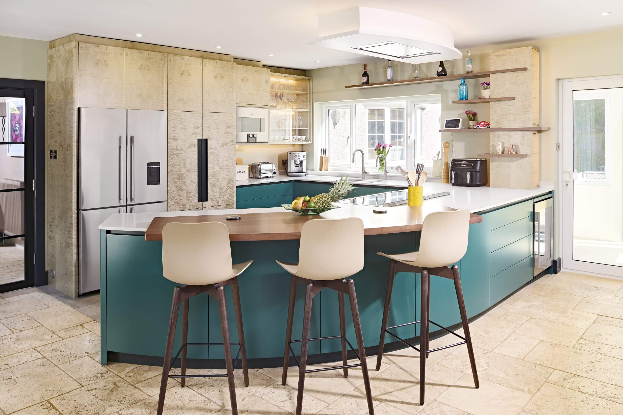
We were delighted to be approached by Yvonne of Yvonne Hellier Interior Design to collaborate on this striking and opulent kitchen in Poole. Yvonne worked with us on our very first kitchen nearly 20 years ago and it is always a pleasure developing ideas and designs with her. Simon refers to her affectionately as “The Queen of Colour” and when you see the images of this beautiful scheme, you will understand why. We had previously teamed up with Yvonne and the client on a different property so it felt natural to work together again on the kitchen for this one.
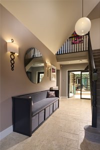
The kitchen and dining room is in the very heart of the house which sits right in the centre of an extensive garden plot. Consequently the room is dual aspect with stunning views of lawns and mature trees on both sides. The space has generous proportions but its position in the centre of the building means that there are windows in opposite walls and doors in the two perpendicular walls and that you have to walk through the kitchen to get to the sumptuous formal sitting room.
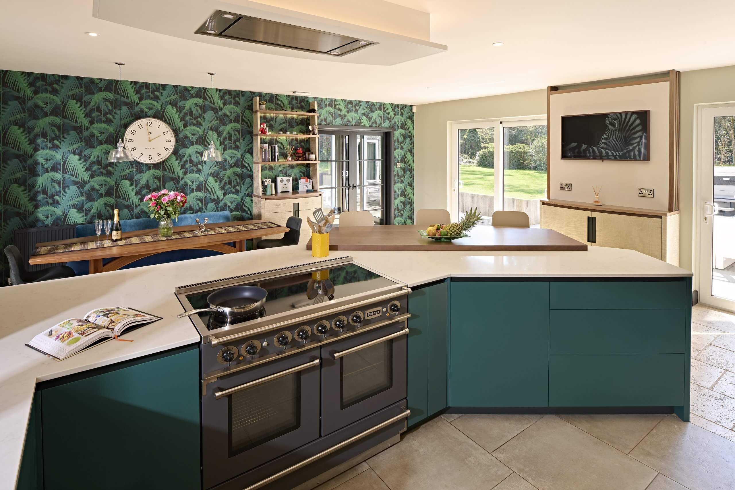
That presented us with some interesting challenges in terms of the positioning of the kitchen. This was a refurbishment of an existing kitchen which already had the services in place so we were restricted with how radical we could be. There was a lot of discussion about the relative merits of islands and peninsula units as well as the colour palette, timber choices and worktops.  Nevertheless we were all able to agree on the final design; a wall of tall units between hall door and window, a sink wall beneath the window and then a long, curved peninsula which creates a flowing feature in the centre of the room and delineates the space between the kitchen and dining areas. By creating the curve we extended the usable worktop and storage space whilst at the same time opening out the space to feel less like a corridor. The eye is drawn into the room and diagonally across towards the conservatory door so that the kitchen units act as a helpful guide instead of an annoying barrier.
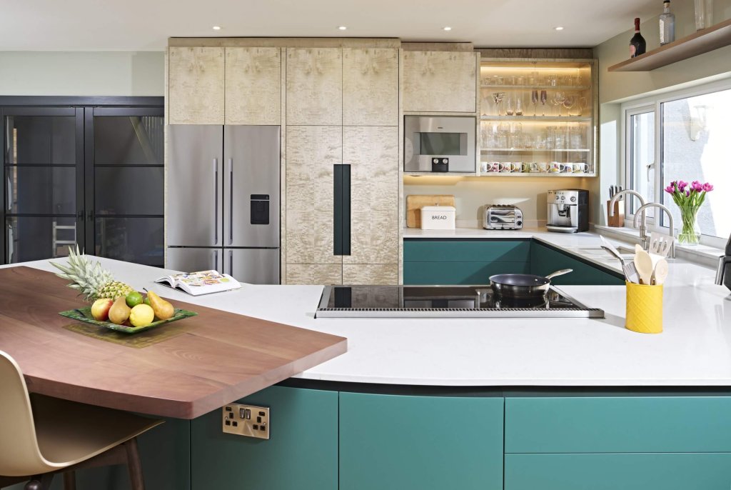
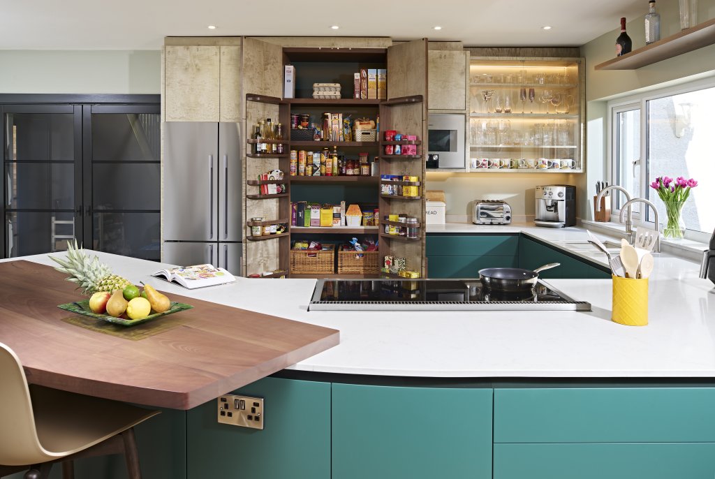
The sink and dishwasher sit within the low cabinets under the window and then the peninsula curves out into the middle of the room in what Simon describes as a ‘hockey stick’ shape. The Falcon Range cooker sits in the centre of the peninsula with a remote controlled Westin cooker hood set into the ceiling above it. On either side of the oven there is a mixture of cupboards and drawer storage all with soft close mechanisms and hidden handles giving the kitchen a streamlined finish. The peninsula houses storage on both the kitchen and dining side so functions as both kitchen storage and sideboard. At the open end there is a lozenge-shaped walnut breakfast bar for more informal meals or for guests to sit with their drink while the host completes the dinner preparations. At the far end a wine fridge is conveniently close to the dining table.
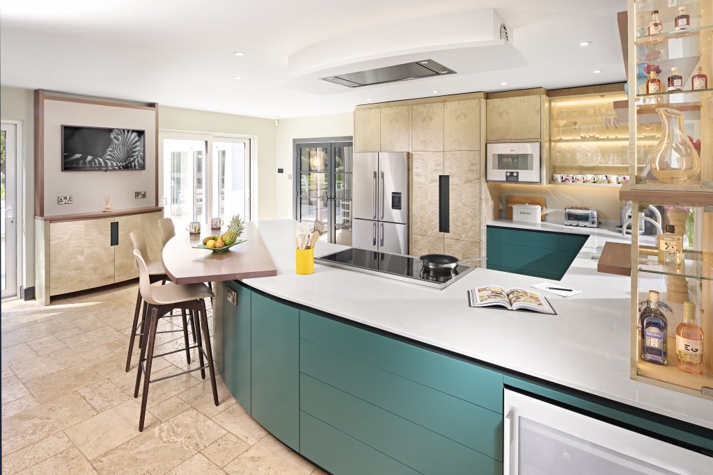
Sitting above the wall end of the peninsula and between the window and the conservatory door is another cleverly designed component. From either of the doors into the kitchen or from the patio it appears to be a column faced with the same figured maple as the principle cabinets and supporting the floating shelves which extend towards and over the window, but as you walk around the peninsula in either direction it reveals that it is in fact a glazed display cabinet. This quirky feature not only provides extra display space but during the day allows light from the windows to pass through and at night casts a wash of light sideways across the darkened windows from LEDs hidden inside.
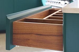
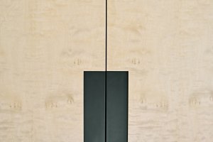
The cabinets are constructed of greyed black walnut. This is where the reddish tint of natural walnut has been toned down so as not to clash with the green in the rest of the colour scheme. As is often the case in one of Simon’s kitchens, the timber has been paired with a complimentary veneer,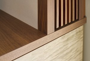
this time a figured maple in Portland grey. This is used to pick out the feature pieces in the room: the larder unit, the dining room dresser and the TV cabinet.
The low cabinet doors and drawers are painted in a rich dark green, ‘Goblin’ from The Little Green Paint Company, and this
gives the kitchen its air of luxurious opulence.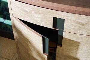 To lighten the room and prevent that opulence feeling oppressive, Yvonne chose ‘Aquamarine’, also from Little Green for the walls and the back of the glazed cabinet and a third shade of green, ‘Studio Green’ from Farrow and Ball for the skirtings, kick boards and cabinet handle detail. The timber tones and paint colours are beautifully tied
  together with London Grey Cesarstone worktops supplied by Eaton Stonemasons.
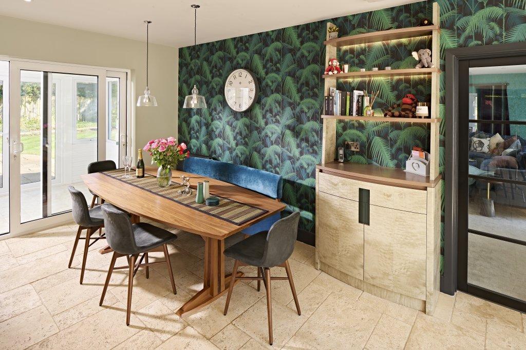
The dining room boasts one of our magnificent 8 seat walnut lozenge dining tables paired with a bespoke bench seat collaboratively designed by Yvonne and Simon and upholstered in a rich royal blue velvet bravely contrasting with the bold palm-frond patterned wall paper and the dark green of the kitchen. Also on this wall is our contemporary take on a French dresser with cupboard storage in the base and open shelving above. Once again, lighting is incorporated into the shelving enhancing the pattern of the wall paper. Facing into the kitchen between two external glass doors is a TV unit specially made with a false back and slatted timber sides to allow air to flow through the electrics hidden behind the wall-mounted TV. Another cupboard sits beneath having a delicate curve emphasising the sense of movement and flow through the kitchen.
Working with Yvonne is always a pleasure, not least because she challenges us to think beyond the usual timber finishes and makes material suggestions and bold colour choices that are an antidote to the current trend for monotone minimalism. It is a symbiotic relationship where elements of her style are incorporated into our kitchen and she runs with themes and ideas taken from our designs in the rest of the room. A true collaboration which has resulted in a truly unique kitchen.
Appliances:
Fridge-Freezer and Wine Fridge: Fisher & Paykel
Range Cooker: Falcon
Cooker Hood: Westin Stratus
Microwave Combi: Gaggenau
Tap: Quooker Flex with Nordic Mixer Tap
Kitchen Sink: The 1810 Company
Integrated Dishwasher: Siemens
Worksurfaces:
Kitchen: Cesarstone – London Grey
Breakfast Bar: greyed walnut
Cost (inc VAT):
Kitchen Cabinetry including breakfast bar, dresser and TV/Radiator cabinet: £60,000
Dining table and bench: £8,000
Appliances: £14,000
Cesarstone worktops: £7,000
Photography:
Double Exposure Photographic
written by Bridget Pirie