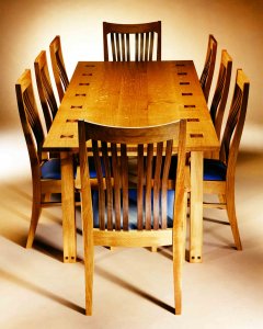
 Still in reflective mood, we continue our tour through 25 years of designing and making chairs. In part 1 I focused on the first chairs I designed, ‘Gazelle’ and ‘Oryx’. They bridged the period from my first real design experience for Bournemouth University’s Senate room and lecture theatre furniture (while still studying on a Masters degree at Hooke Park), up to establishing Simon Thomas Pirie as a design and make business in 1998.
You can visit our ‘sitting’ gallery and look through more of our chair designs on the Simon Thomas Pirie website by clicking here.
Many of our early commissions were for dining furniture and it was usually a set of Oryx chairs that would grace these tables, but despite Gazelle & Oryx working well on those projects they have always been a time consuming chair to make, which inevitably made them expensive. In 1999 we received an enquiry for 80 restaurant chairs from a well-known architectural practice who had seen images of Oryx in the design press. Through further discussions it became clear that the cost of Oryx would be prohibitive. As this was an issue I had encountered before with residential clients I decided to design a more simple chair with a slatted back that could meet the restaurant’s budget restraints. In doing so I hoped we would also open up our bespoke chair offering to a wider client base.
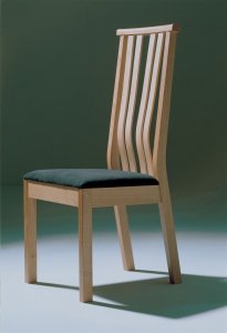 The result of this exercise was the ‘Impala’ chair, its name following the sequence established with Gazelle and Oryx. The 1st prototype, shown here on the right, was made quickly to try and land the London restaurant job. Impala has 4 laminated curved back slats and a tall back with overhanging top rail (another little nod to Ron Carter’s work). This detail makes the chair very easy to pull out and move, ideal for restaurant type situations. It also has a drop-on, upholstered seat pad and like its predecessors was supremely comfortable ‘straight out of the box’. From a making perspective it was significantly faster to make (Oryx took 20 to 25 hours each depending on batch size whereas Impala was down to 10 to 12 hours), it also took a lot less material input. All of a sudden we had a chair we could sell at a competitive price for a bespoke workshop and even though we didn’t get the restaurant project in the end, the design process it had spurred turned out to be a very valuable one.
Although we continued to sell Oryx and Gazelle, the Impala became our mainstay chair and we sold a lot of them over the next decade or so. I did try to add up numbers but it got hazy at around 200-250. Now that’s not mass manufacturing by any means, but it was good steady batch production from a small workshop like ours. 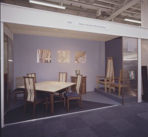 We launched Impala at the House & Garden Fair in 1999 with our folding ‘Lily’ square table. This prototype table and first batch of Impala became my own dining set which I used for nearly 20 years. It is now owned by an architect friend whom I’m sure will make good use of it for many more years to come. There are scores of families just like mine and his sitting around dining tables of all shapes and sizes on Impala chairs. Knowing they are at the heart of so many homes and ‘just the furniture the children have grown up with’ give us all enormous pleasure here at STP. We have also produced a wider 6 slat armchair version of Impala although we’ve not done many of those, most clients opting for a more democratic seating arrangement.
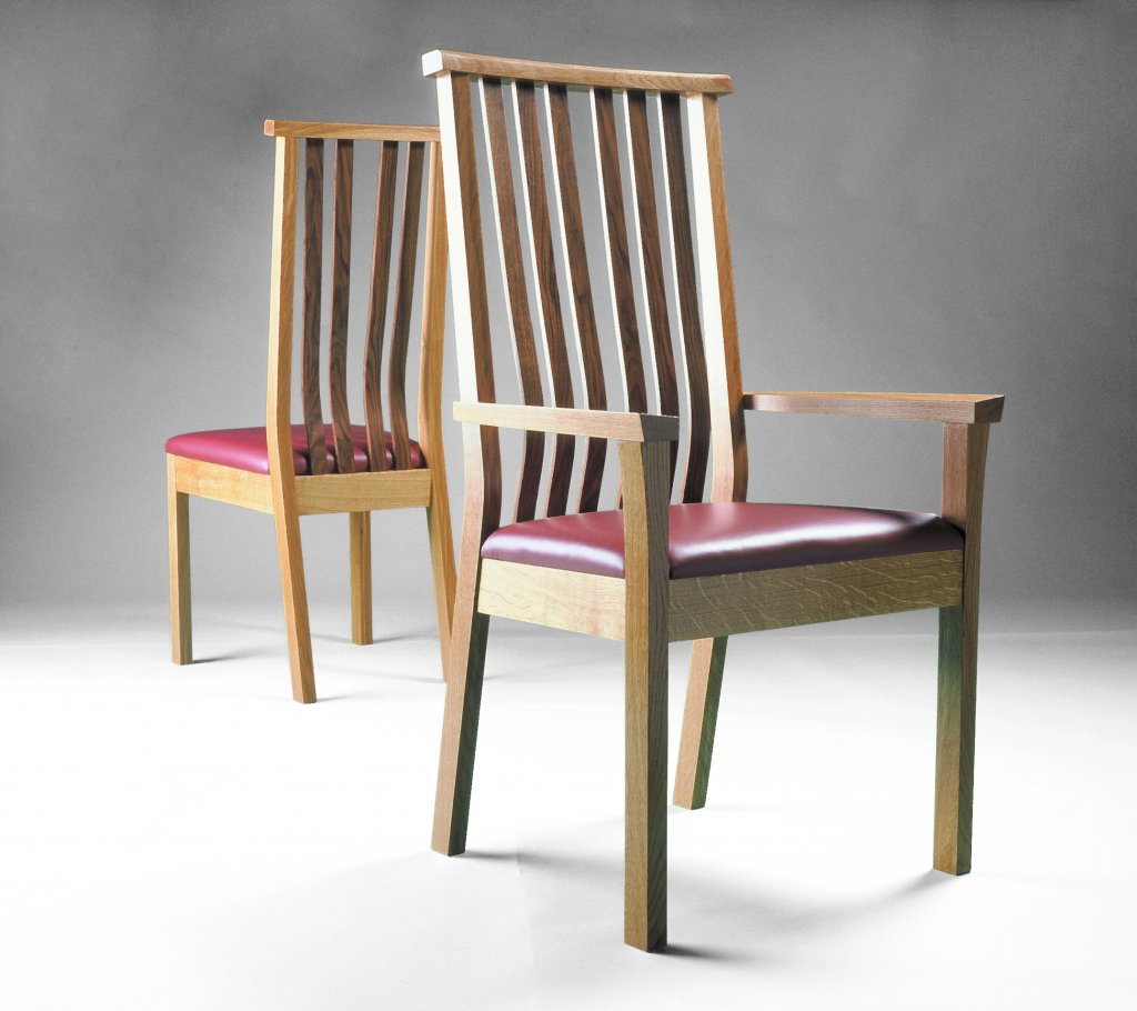
The speed of development of that Impala chair gave me further confidence in the workshop’s ability to design and make chairs. Over the next couple of years as well as developing more of our own designs we were approached by other businesses including Sable Island, Timothy Mark and a member of the Heal’s family to design and prototype chairs, a process which was rewarding and useful in terms of learning new techniques.
I have picked out a few more of my favourites, many of which came off the back of larger projects. In fact the next two are both spin-offs from the first two big kitchen projects we designed. Having designed the complete kitchen I was always keen to incorporate furniture by us as well, it’s now commonplace for us to do large fitted projects and design lots of free standing pieces to compliment, but at the time (2003 to 2006) this was all new fertile ground. Something we had not yet done was design a stool to sit people up at breakfast bar height.
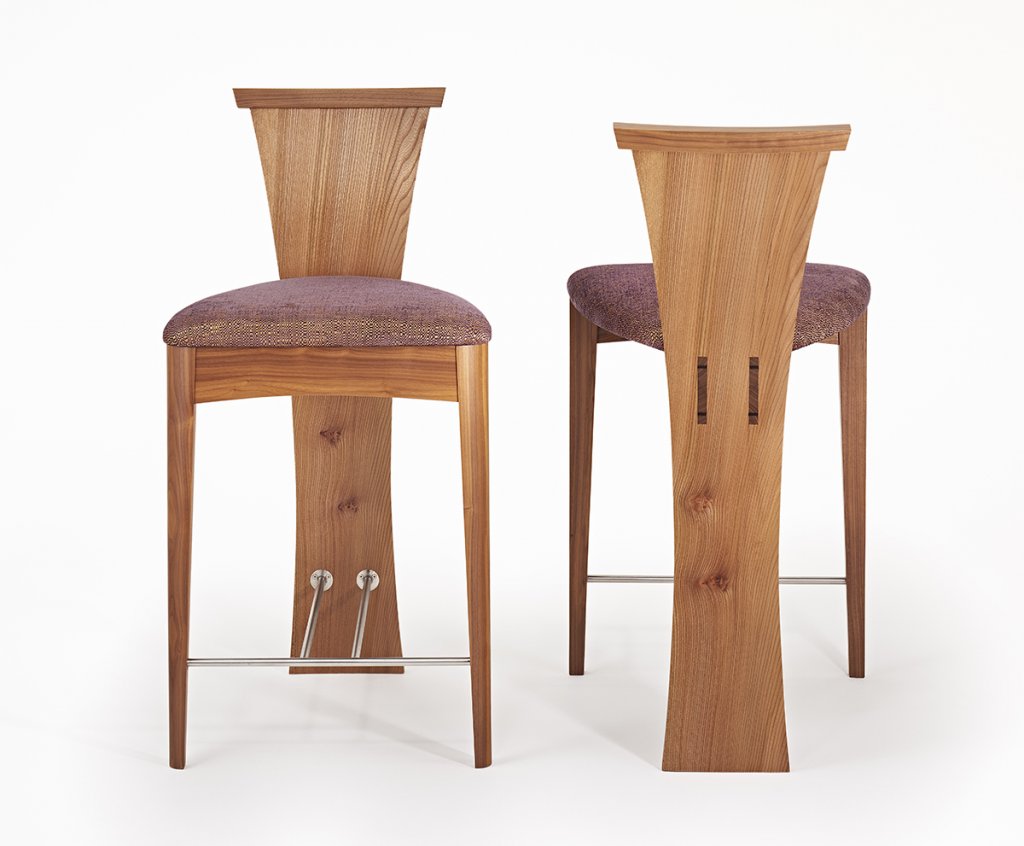
‘Guinness & Murphy’ was our response to this. The name actually came from the black and chocolate labradors the client owned, but I liked the play of the words for a bar stool and its associations with propping up the bar with a pint. It stuck. It’s a really elegant piece because of the single elongated curved back and leg panel. The other key feature is the inclusion of the stainless foot frame which acts as the tie-beam between the 3 legs. It also has a very ‘crafty’ through-wedged, tenon joint from the centre frame through the back panel which expresses the way it’s made very clearly. Guinness and Murphy are still a favourite of mine, so much so I bought that original 2003 set back to put in my own kitchen 15 years later. They still look like new.
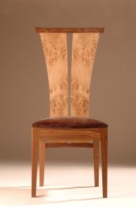 ‘Thurlestone’ was another chair that came off the back of a kitchen project. The client was a developer but this house was going to be for his own family in Surrey. In this case we also made the furniture for a dining room next to the kitchen. The table was an impressive 12 seater made of oak and walnut and complimented the lavish kitchen next door, he wanted a chair that would also have a ‘wow’ factor, using the same rich burr woods we had used in the kitchen. The Thurlestone chair used similar bent laminated back forms we had developed for ‘Guinness & Murphy’ stools, but in this case there were a pair of them that connected to the more traditionally constructed leg framework below. It is a very handsome looking chair and like Guinness & Murphy and Impala it carries what has become a bit of a trademark detail of the overhanging top rail. Despite really liking this chair we only ever made one set. There is more on this kitchen and dining set project in the Case Study.
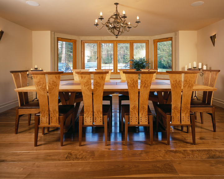
Years later I reworked many of the Thurlestone chair’s technical ideas and visual cues into its more elegant successor, ‘Gabriel’. I’d always wanted to revisit the slightly awkward connection detail between the back panels and back frame on Thurlestone and in effect the solution was staring me in the face; using the paired laminated back panels as both the backs and legs in one piece like we had done on the Guinness & Murphy stool.
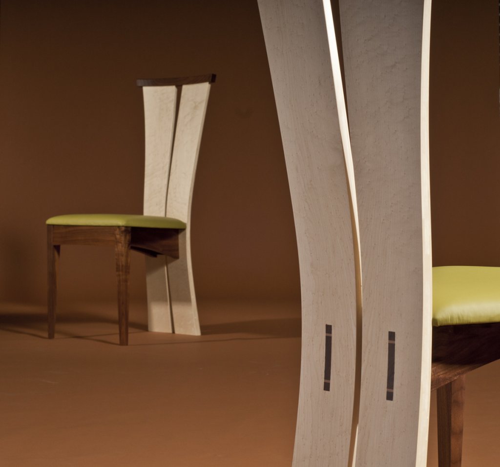
In many ways it is the hybrid of those two previous designs. Gabriel has very elegant proportions, it straddles being a very contemporary chair with a hint of the art deco. It’s very curvaceous and despite the solid laminated back panels is very comfortable. Those panels do have lots of natural flex so the chair does ‘give’ alot as you move around on it. There are subtle things going on within the construction as well. The paired left and right back panels are made from hand-cut, tapered laminates which we cut out of a solid slab of 2 inch timber. That means the weight and balance of the chair is in the right place as you pull it out with the trade-mark overhanging top rail. The seat also appears to float as there are no side rails. Instead a thick beam supports the seat and connects the front frame to the back panels. We use a similar, visible through-tenon-with-wedge detail to Guinness & Murphy. As these splay out they effectively become a captive, dovetail joint really securing the backs in place. Gabriel offers us the opportunity to play with book-matching those two back panels, making the decorative possibilities pretty endless. It has lent itself to lots of fantastic decorative timber combinations, which together with the seat fabric choice means the 15 or so sets we have made all look very different.
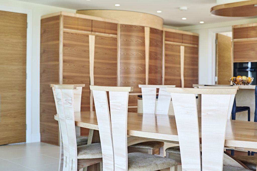
Whilst writing this ‘History’ it has become clear to me that every chair I’ve designed combines a reaction to a new design brief with the evolution of previous chair designs and the elements that were successful in them.
Chairs are the ultimate design challenge for a furniture designer/maker. It’s like a piece of mini architecture, as you live in, on and around it all the time there really is nowhere to hide if you get it wrong. Designing a chair is difficult, I’ve watched plenty of students, apprentices and wannabe-designers start what they think is going to be an easy exercise only to crumple under the complexity of making a chair structurally sound, comfortable to sit in and good looking on the eye.
I still love to see piles of chair components around the workshop and stacks of frames nearing completion. After 25 years at it I think I’m pretty good at designing chairs; at least, I’ve not had a horror story yet, but then I probably wouldn’t tell you anyway!
If you want to discuss chairs with Simon Thomas Pirie, be it an existing design or something entirely new – just click the enquiry form at the top of the page, email us or just pick up the phone for an informal chat.
Written by Simon
Back to: Simon Thomas Pirie – A Chair Design History – Part 1
Forward to: Simon Thomas Pirie – A Chair Design History – Part 3